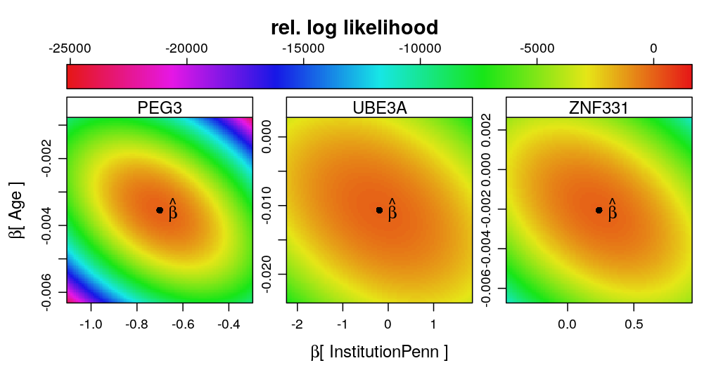
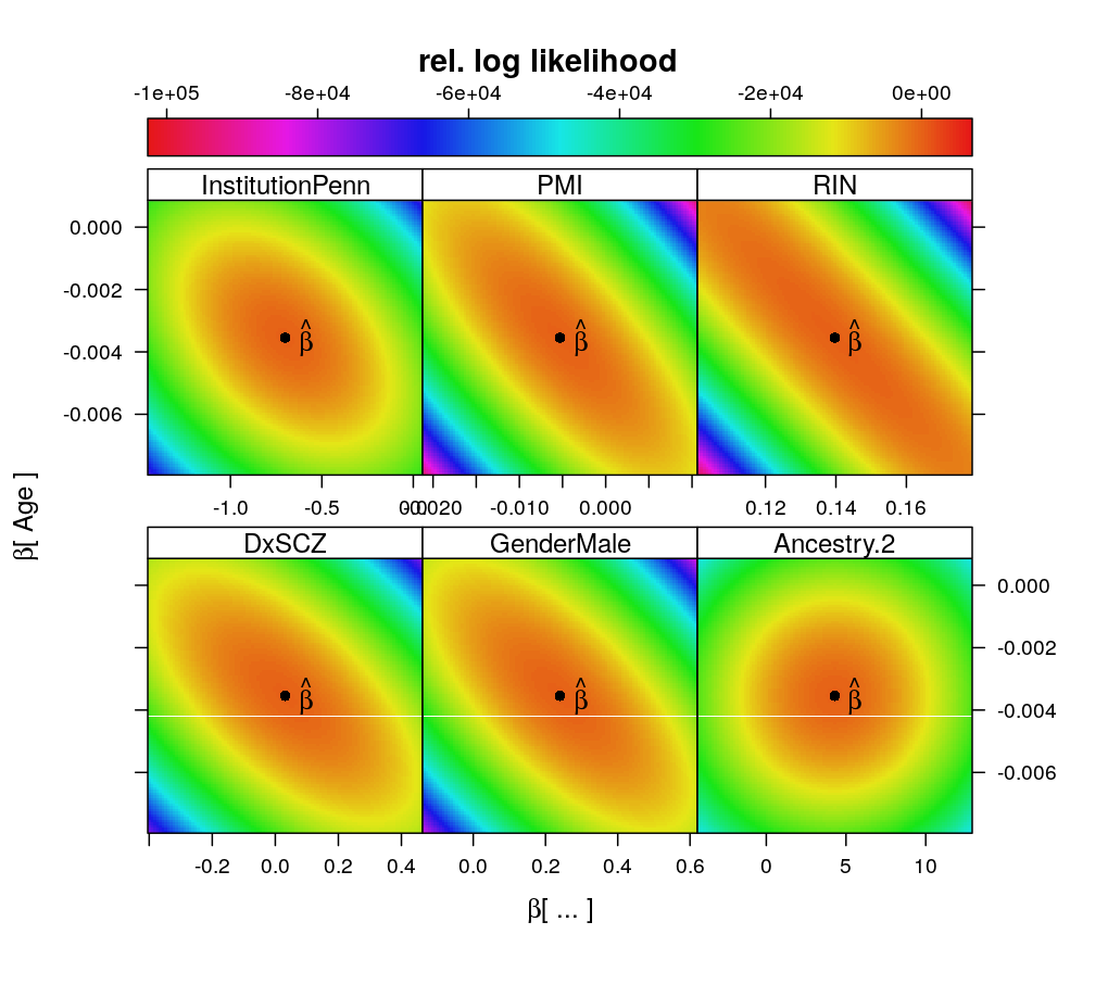
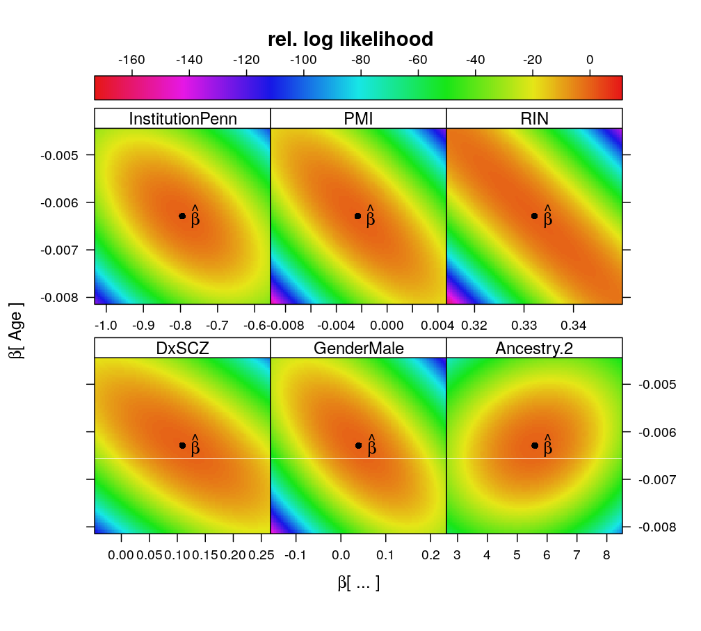
In the present observational study the effects of predictors are random. Associations among predictors has a negative impact on maximum likelihood estimation (MLE) of the vector of regression coefficients . This is because the association (in the probabilistic sense, i.e. dependence) among predictors induces an association among the coefficients themselves in the sense of a specific directionality in the gradients of the likelihood surface; that directionality is what makes MLE less reliable. Confidence regions of all coefficients are quasi-ellipsoids on the -dimensional parameter space on which the likelihood function is defined.
Plotting ellipses that are the two-dimensional sections of these ellipsoids—e.g. as a contourplot—, illustrates vividly the pairwise association between some and . This corresponds to a -dimensional restriction of the -dimensional parameter space that is achieved by fixing the remaining coefficients at their MLE or at some theoretically meaningful value. The stronger the association is the more diagonally elongated shape the ellipse takes. The extreme case is collinearity of and , in which case the two are unidentifiable and the ellipse becomes a pair of parallel contour lines so MLE fails since there is no unique maximum of the likelihood function.
For association among predictors see 2016-06-26-trellis-display-of-data. Note that association does not in general violate the linearity assumption of (generalized) linear models but in the present study it appears to do so as shown in 2016-07-08-conditional-inference.
Data preparation
## Loading required package: RColorBrewer
Load data importer functions:
source("../../src/import-data.R")
source("../../src/fit-glms.R")
source("../../src/likelihood-surface.R")
Do the import:
genes2fit <- unlist(read.csv("../../data/genes.regression.new", as.is = TRUE))
names(genes2fit) <- genes2fit
E <- get.predictors() # default arguments
Y <- get.readcounts(gene.ids = genes2fit, count.thrs = 0)
Fit models:
# exclude unweighed aggregates UA.8 and UA from fitting
ids2fit <- grep("^UA(.8)?$", names(Y), value = TRUE, invert = TRUE)
M <- do.all.fits(Y[ids2fit], preds = e.vars)
f.ids <- as.data.frame(lapply(M, function(m) ! sapply(m, is.null)))
f.ids["TMEM261P1", c("logi.S", "logi2.S")] <- FALSE
f.ids[c("WA.8", "WA"), ] <- FALSE # gene aggregates are not needed here
Results
Relative LL surface
Select a gene
gene <- "PEG3"
The expressions below restrict the likelihood function, defined on a 22 dimensional parameter space, to various 2D subspaces (planar slices) defined by pairs of parameters; the remaining 20 parameters are held fixed at the maximum likelihood location .
dat <- list()
l.M <- M$wnlm.Q; ll.fun <- ll.wnlm; args.fun <- args.wnlm
dat$coefs.wnlm.Q <-
    rbind(ll.grid(l.M = l.M, v.name.A = "InstitutionPenn", CI.lev.A = c.a <- 1 - 1e-9, CI.lev.B = c.b <- 0.9, ll.fun = ll.fun, args.fun = args.fun),
          ll.grid(l.M = l.M, gene = gene, v.name.A = "PMI", CI.lev.A = 0.9999, CI.lev.B = c.b, ll.fun = ll.fun, args.fun = args.fun),
          ll.grid(l.M = l.M, gene = gene, v.name.A = "RIN", CI.lev.A = 0.5, CI.lev.B = c.b, ll.fun = ll.fun, args.fun = args.fun),
          ll.grid(l.M = l.M, gene = gene, v.name.A = "DxSCZ", CI.lev.A = 1 - 1e-6, CI.lev.B = c.b, ll.fun = ll.fun, args.fun = args.fun),
          ll.grid(l.M = l.M, gene = gene, v.name.A = "GenderMale", CI.lev.A = 1 - 1e-5, CI.lev.B = c.b, ll.fun = ll.fun, args.fun = args.fun),
          ll.grid(l.M = l.M, gene = gene, v.name.A = "Ancestry.2", CI.lev.A = 1 - 1e-11, CI.lev.B = c.b, ll.fun = ll.fun, args.fun = args.fun))
fac <- factor(dat$coefs.wnlm.Q$v.name.A)
dat$coefs.wnlm.Q$v.name.A <-
    factor(dat$coefs.wnlm.Q$v.name.A, ordered = TRUE,
           levels = c("InstitutionPenn", "PMI", "RIN", "DxSCZ", "GenderMale", "Ancestry.2"))
l.M <- M$wnlm.Q; ll.fun <- ll.wnlm; args.fun <- args.wnlm
dat$coefs.wnlm.Q.2 <-
    rbind(ll.grid(l.M = l.M, gene = gene, v.name.A = "Ancestry.2", CI.lev.A = 1 - 1e-13, CI.lev.B = 0.995, ll.fun = ll.fun, args.fun = args.fun))
fac <- factor(dat$coefs.wnlm.Q.2$v.name.A)
dat$coefs.wnlm.Q.2$v.name.A <-
    factor(dat$coefs.wnlm.Q.2$v.name.A, ordered = TRUE,
           levels = c("InstitutionPenn", "PMI", "RIN", "DxSCZ", "GenderMale", "Ancestry.2"))
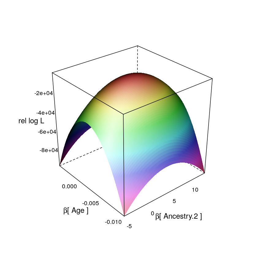
This is one example for a restricted likelihood function, defined on the subspace of :
ll.wireframe(dt = dat$coefs.wnlm.Q.2, v.A = "Ancestry.2", par.settings = list(axis.line = list(col = "transparent")))
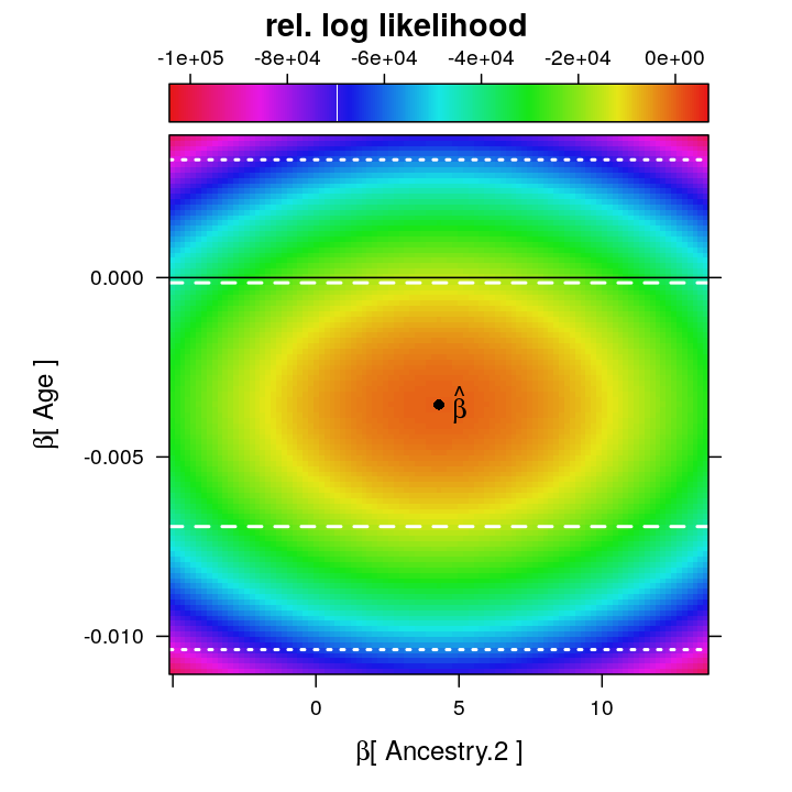
Now the same restricted function in levelplot representations. First with confidence intervals (0.8 and 0.99) and for …
lp2 <- ll.surfaceplot(fm = formula(rel.log.L ~ beta.A * beta.B | v.name.A),
                      df = dat$coefs.wnlm.Q.2[dat$coefs.wnlm.Q.2$v.name.A == "Ancestry.2", ],
                      hv.B = c(0,
                               unlist(get.single.estimate.CI(M$wnlm.Q$PEG3, 0.80)["Age", c("Lower.CL", "Upper.CL"), drop = TRUE]),
                               unlist(get.single.estimate.CI(M$wnlm.Q$PEG3, 0.99)["Age", c("Lower.CL", "Upper.CL"), drop = TRUE])))
update(lp2, strip = FALSE, xlab = expression(paste(beta, "[ Ancestry.2 ]")), ylab = expression(paste(beta, "[ Age ]")), main = "rel. log likelihood")
…and then the same intervals and for .
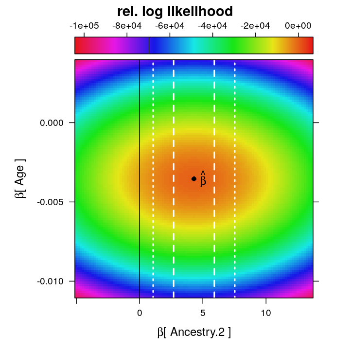
Even though at the ML estimate the observed information for is smaller than that for , the confidence interval for is broader, which contradicts the expected narrower CI for under the asymptotic normality of . Although this might indicate poor model fit it appears also plausible that is more strongly non-orthogonal than to one or more other ’s, and that non-orthogonality more greatly increases the variance of compared to the variance that this 2D restriction of the log likelihood visually suggests.
Orthogonality of to other coefficients
Relative log likelihood is shown for straight forward comparison between different models. is associated with coefficients of both technical and biological predictors. Association to the coefficient of RNA-quality RIN (RNA Integrity Number) is the strongest. From these pairwise associations the network of causal dependencies does not follow directly.
wnlm.Q, PEG3
ll.surfaceplot(fm = formula(rel.log.L ~ beta.A * beta.B | v.name.A), df = dat$coefs.wnlm.Q,
               layout = c(3, 2),
               par.settings = list(regions = list(col = rev(trellis.par.get("regions")$col))),
               main = "rel. log likelihood",
               xlab = expression(paste(beta, "[ ... ]")),
               ylab = expression(paste(beta, "[ Age ]")))
logi.S, PEG3
Variance matrix of
Under regularity conditions the maximum likelihood estimate is asymptotically normal so that . Thus the inverse of the Fisher information evaluated at the unknown true value of is the variance matrix of the ML estimate. The R help page for vcov writes that this function returns
A matrix of the estimated covariances between the parameter estimates in the linear or non-linear predictor of the model.
Based on this vcov returns something like , which is the inverse of the observed information evaluated at the ML estimate and which is meant to estimate . To see the correlation structure of :
levelplot(cov2cor(vcov(M$wnlm.Q$PEG3)), scales = list(x = list(rot = 90)), xlab = "", ylab = "", main = "wnlm.Q")
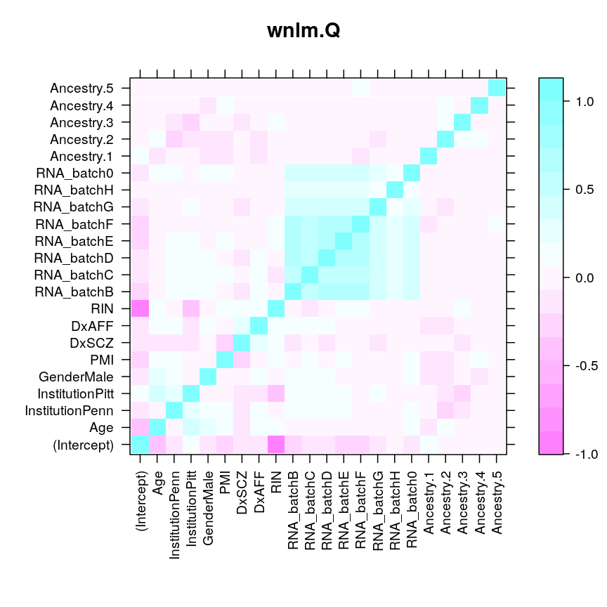
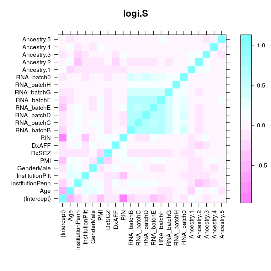
These plots do not show even just nearly as high correlation between and as it seems from the very elongated diagonal quasi-ellipse in the likelihood surface restricted to . For example, under wnlm.Q, the correlation 0.098913, while for the circle-like ellipse 0.0979938. The fact that using the vcov function gives is also puzzling since the elongated ellipse runs from the top left to the bottom right suggesting that . At this point I cannot resolve these contradictions.
Consistency among genes
The same pattern of associations can be observed for other genes as well. The model for PEG3 is supported by more observations and total read count than for UBE3A or ZNF331, and therefore the likelihood surface is more peaked (higher information content, larger curvature around the estimate).
l.M <- M$wnlm.Q; ll.fun <- ll.wnlm; args.fun <- args.wnlm
dat$genes.wnlm.Q <- # using v.name.A = "InstitutionPenn" as default
    rbind(ll.grid(l.M = l.M, gene = "PEG3", CI.lev.A = 1-1e-3, CI.lev.B = 0.7, ll.fun = ll.fun, args.fun = args.fun),
          ll.grid(l.M = l.M, gene = "UBE3A", CI.lev.A = 1-1e-15, CI.lev.B = 1-1e-2, ll.fun = ll.fun, args.fun = args.fun),
          ll.grid(l.M = l.M, gene = "ZNF331", CI.lev.A = 1-1e-15, CI.lev.B = 1-2e-2, ll.fun = ll.fun, args.fun = args.fun))
