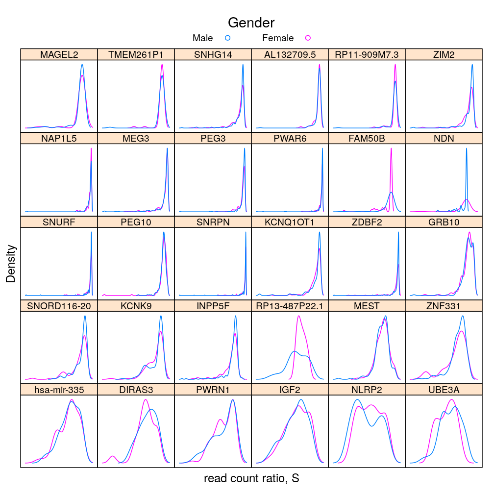
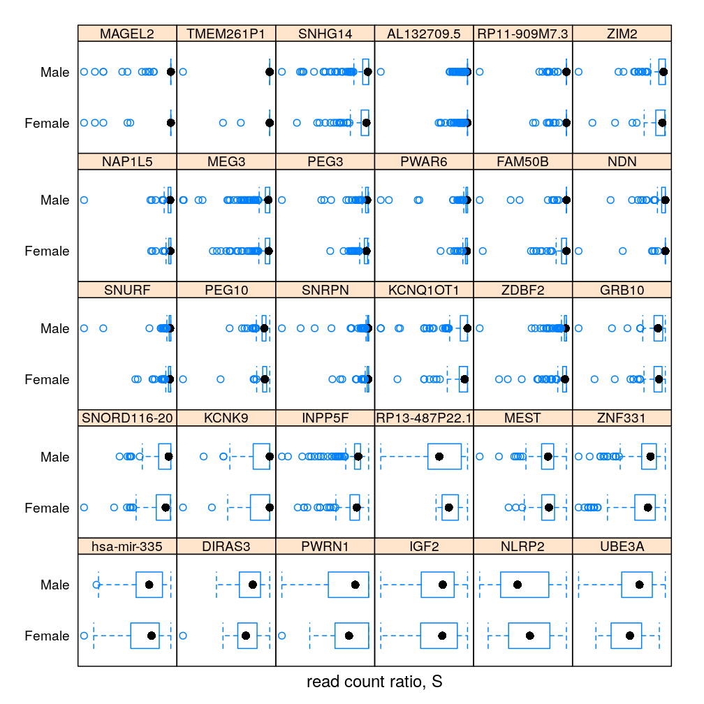
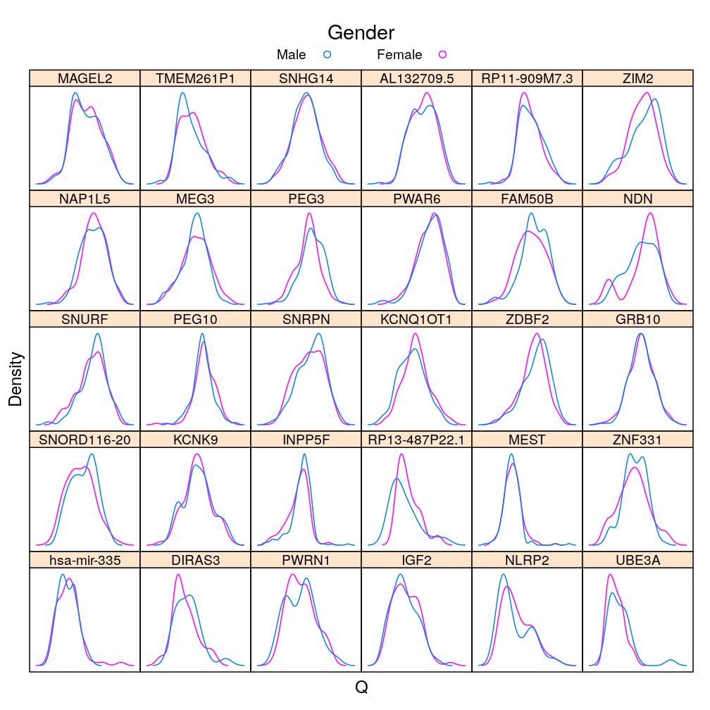
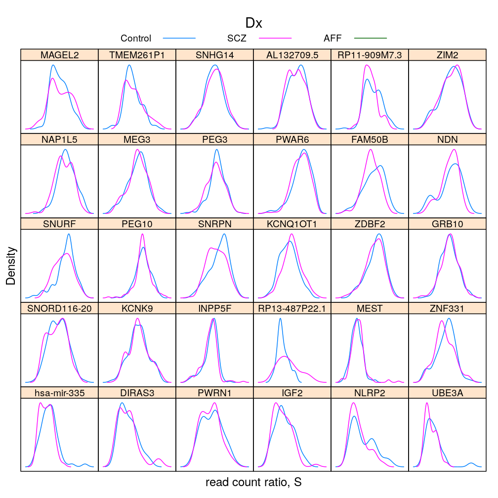
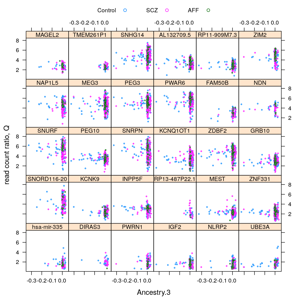
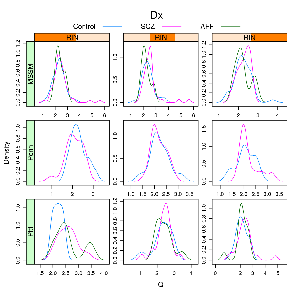
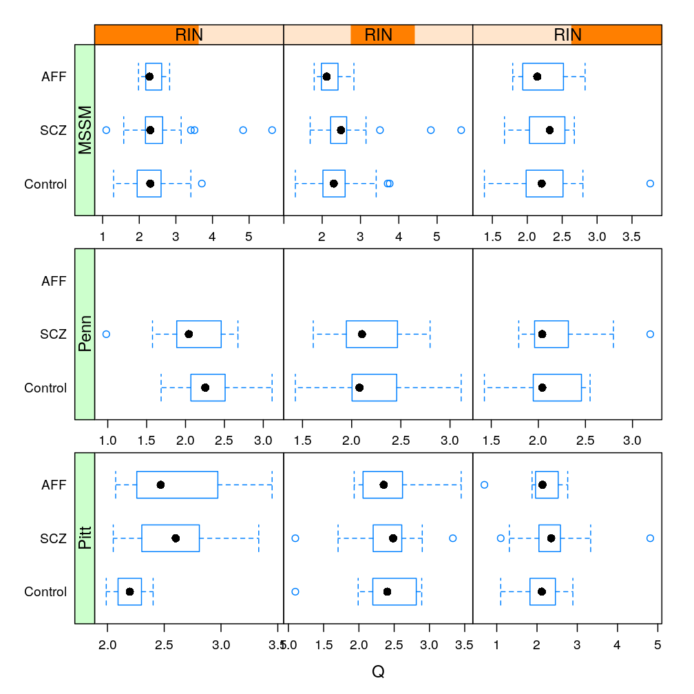
This analysis presents plots of the conditional distribution of the read count ratio statistic or its quasi-log transformed version given each a gene a predictor of interest, which is either Gender or Dx. For the predictor Age see the previous post trellis display of data. In the present post a more detailed conditioning is done, using RIN and Institution for MEG3 and MEST. These are genes found in a previous analysis (see permutation test) to be significantly associated to Gender and Dx, respectively. The plots below show that the distributions greatly overlap between differing levels of gender or disease even for the most significantly associated genes, and that this holds in case of further conditioning on RIN and Institution.
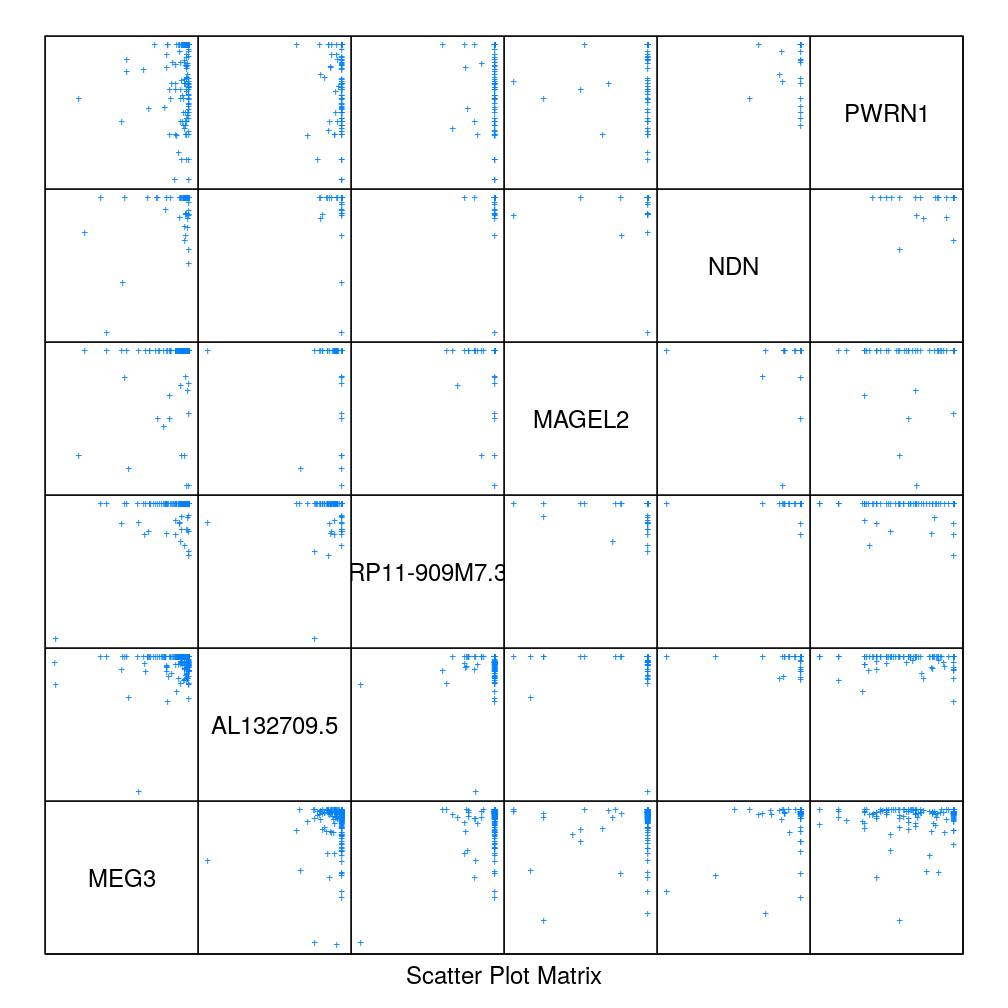
A distinct but related question is also addressed here, namely the correlation between (or ) given one gene and that given another gene when the genes are near each other (in the same imprinted gene cluster) or far away (e.g. on a different chromosome). However, no clear pattern emerges from this part of the analysis.
Conditioning on a gene and some predictor(s)
Import data on read counts and predictors and cast them in convenient long format.
gene.ids <- unlist(read.csv("../../data/genes.regression.new", as.is = TRUE))
names(gene.ids) <- gene.ids
Y.long <- reshape.Y2long(gene.ids)
Gene and Gender
my.update <- function(dp, ...) {
    update(dp, scales = list(x = list(draw = FALSE, relation = "free")),
           par.settings = list(add.text = list(cex = 0.8)),
           xlab = "read count ratio, S",
           ...)
}
statistic
dp <- densityplot(~ S | Gene, groups = Gender, data = Y.long, plot.points = FALSE)[1:30]
update(my.update(dp, auto.key = list(title = "Gender", text = c("Male", "Female"), columns = 2, points = TRUE, lines = FALSE)),
       par.settings = list(superpose.line = list(fill = trellis.par.get("superpose.symbol")$fill[c(2, 1)],
                                                   col = trellis.par.get("superpose.symbol")$col[c(2, 1)])),
       scales = list(draw = FALSE, relation = "free"))
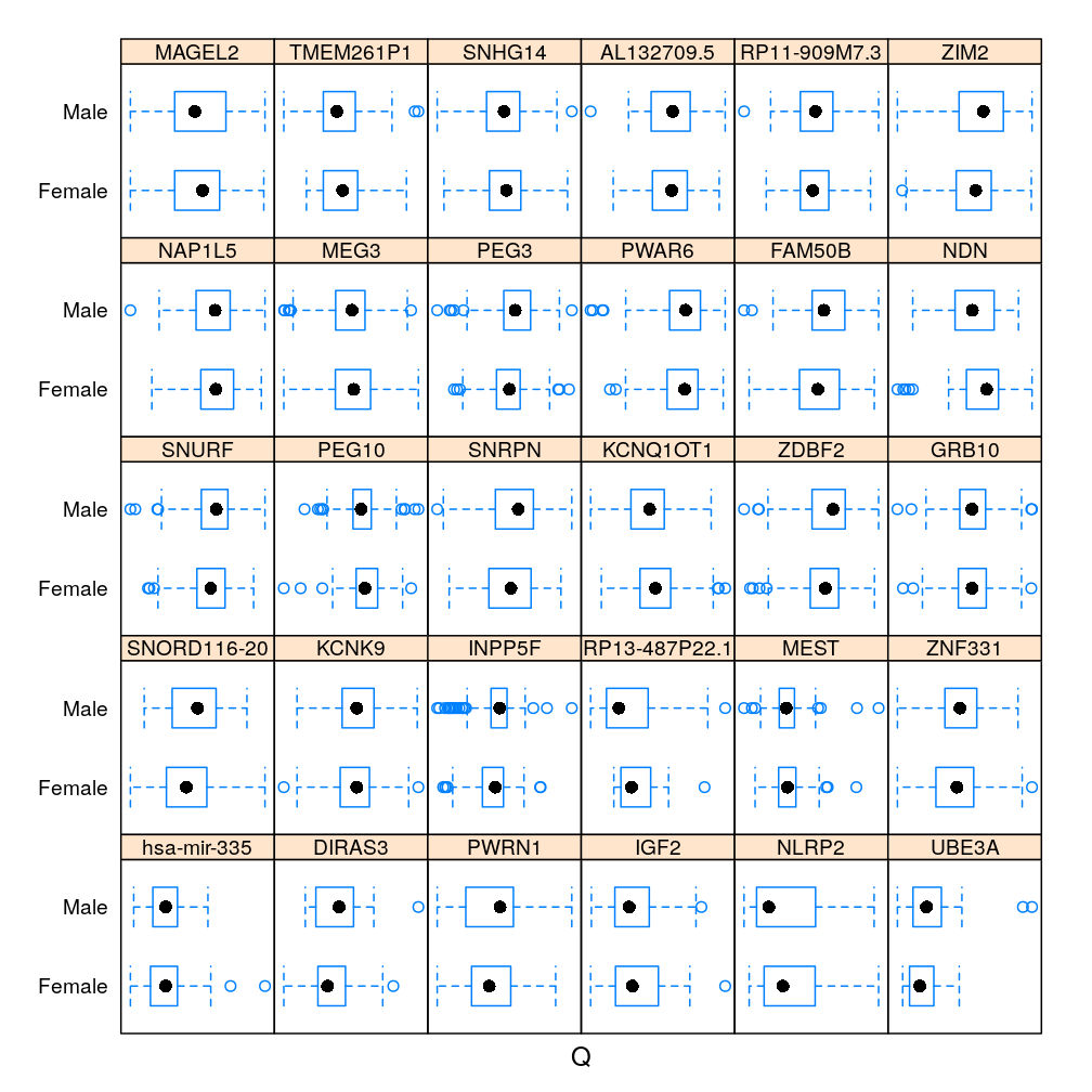
The same information in box and whisker representation:
dp <- bwplot(Gender ~ S | Gene, data = Y.long)[1:30]
my.update(dp)
statistic
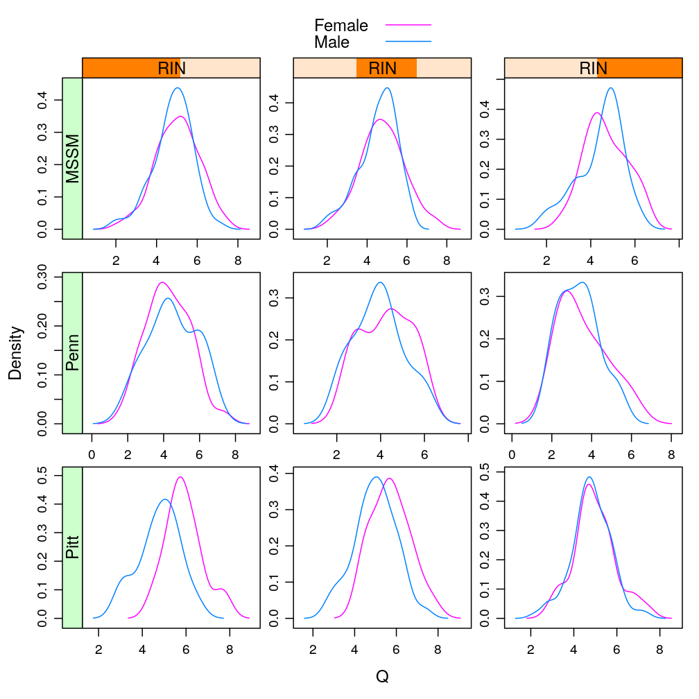
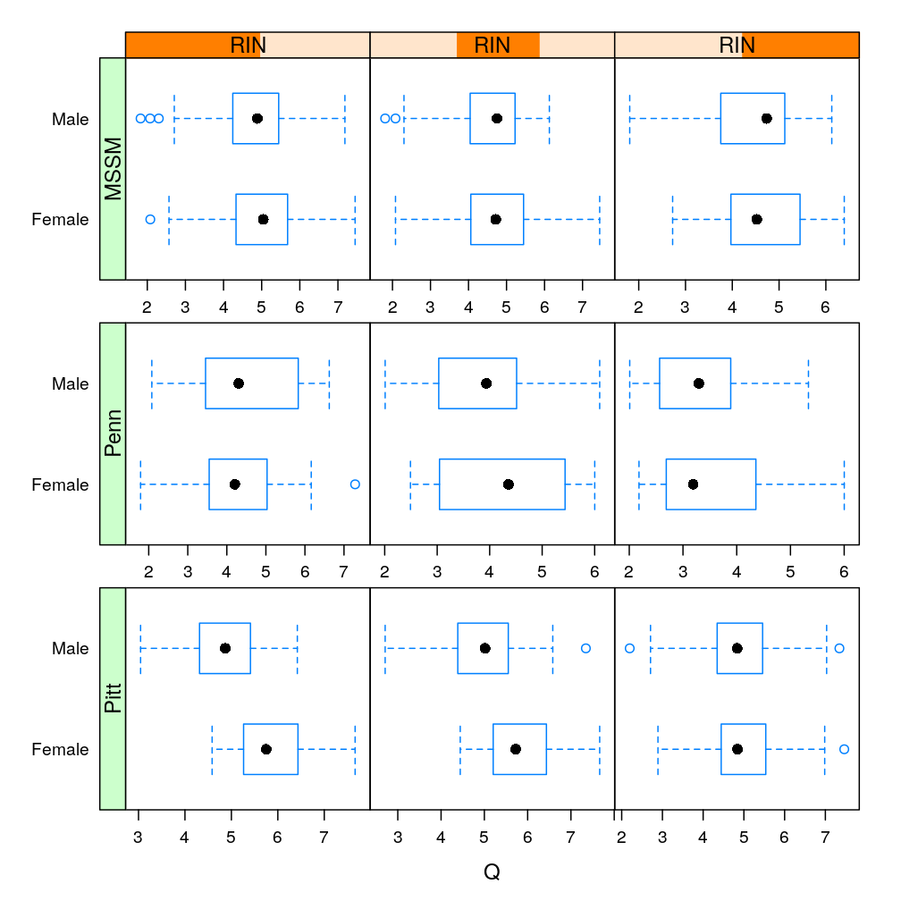
Only with MEG3, the most significantly affected gene by Gender (see a later post), conditioning on various RIN intervals
Y.long$RIN.copy <- Y.long$RIN
Y.long$RIN <- equal.count(Y.long$RIN, number = 3)
lp <- densityplot(~ Q | RIN * Institution, data = Y.long, groups = Gender, subset = Gene == "MEG3",
                  scales = list(relation = "free"), plot.points = FALSE,
                  par.settings = list(superpose.line = list(fill = trellis.par.get("superpose.symbol")$fill[c(2, 1)], col = trellis.par.get("superpose.symbol")$col[c(2, 1)])),
                  auto.key=TRUE)
useOuterStrips(lp)
lp <- bwplot(Gender ~ Q | RIN * Institution, data = Y.long, subset = Gene == "MEG3", scales = list(x = list(relation = "free")),
            auto.key=TRUE)
useOuterStrips(lp)
Gene and Dx
statistic
For the density plots AFF had to be excluded (for some genes there are too few AFF individuals for kernel density estimation)
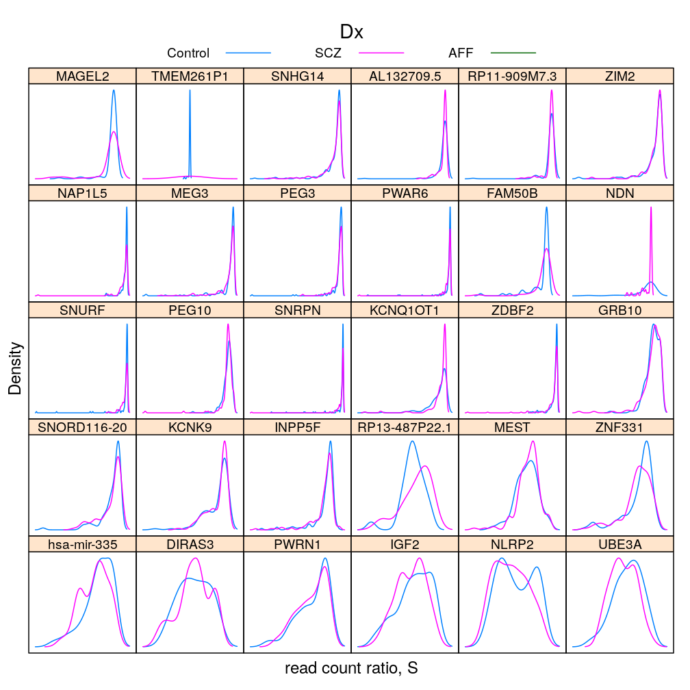
The same information (extended with AFF) in box and whisker representation:
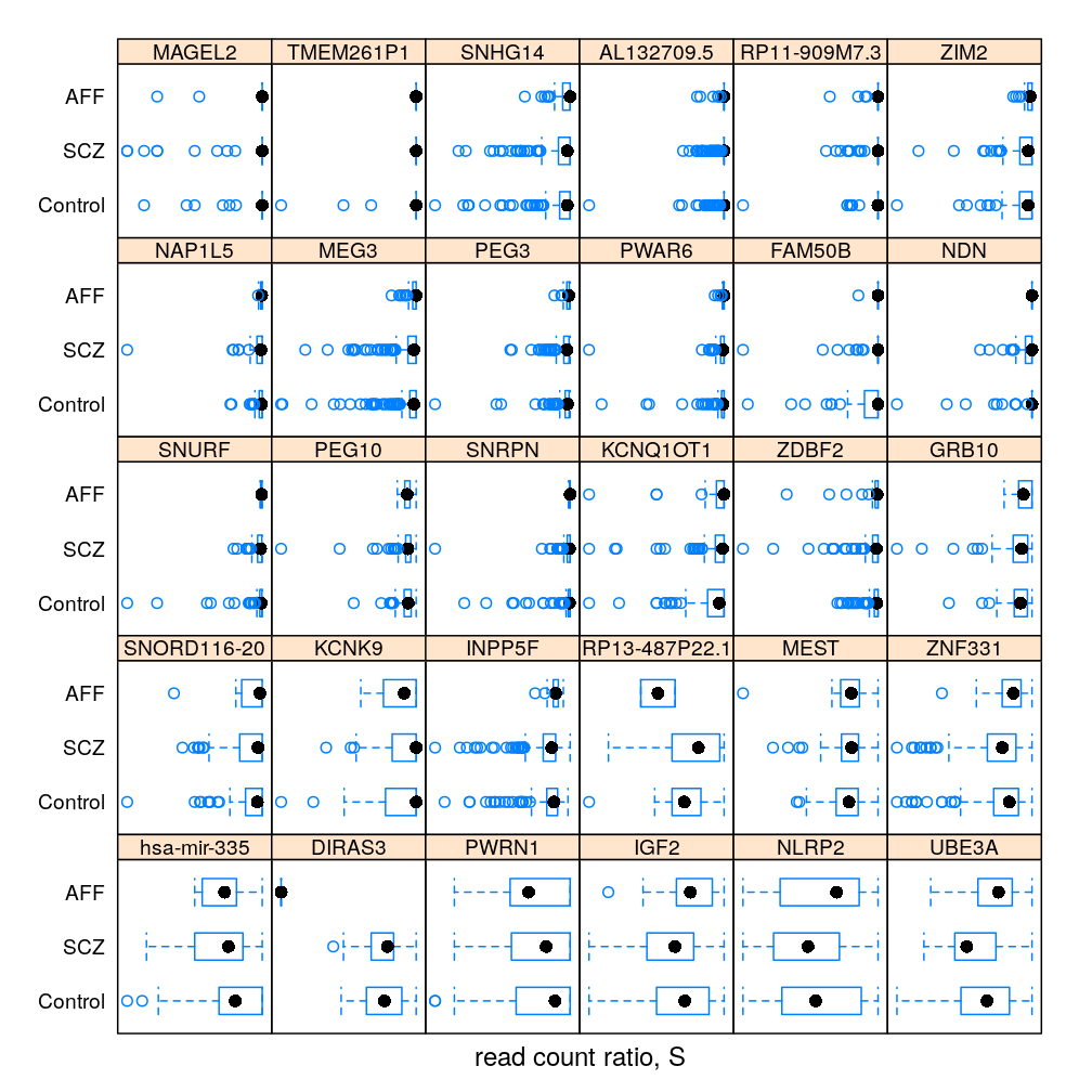
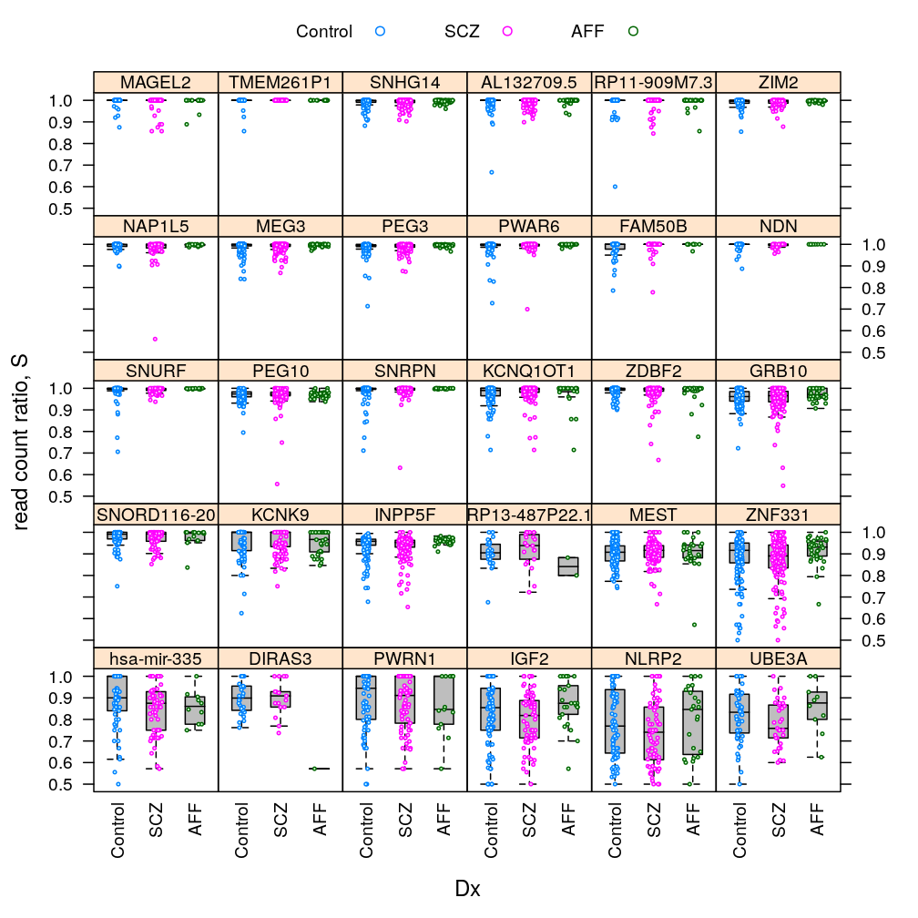
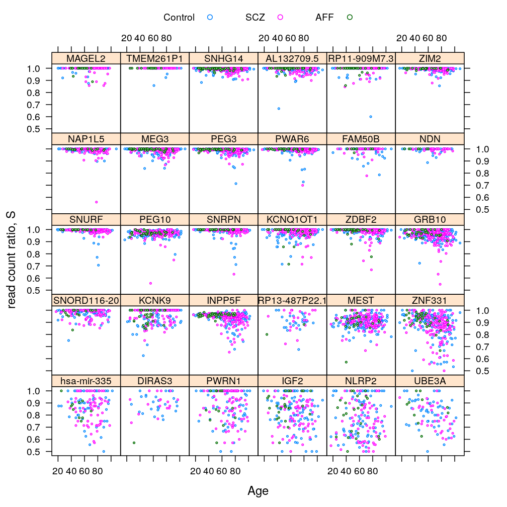
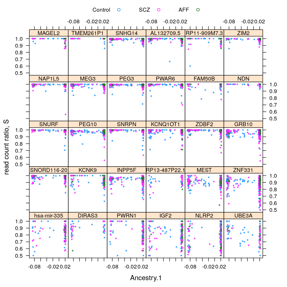
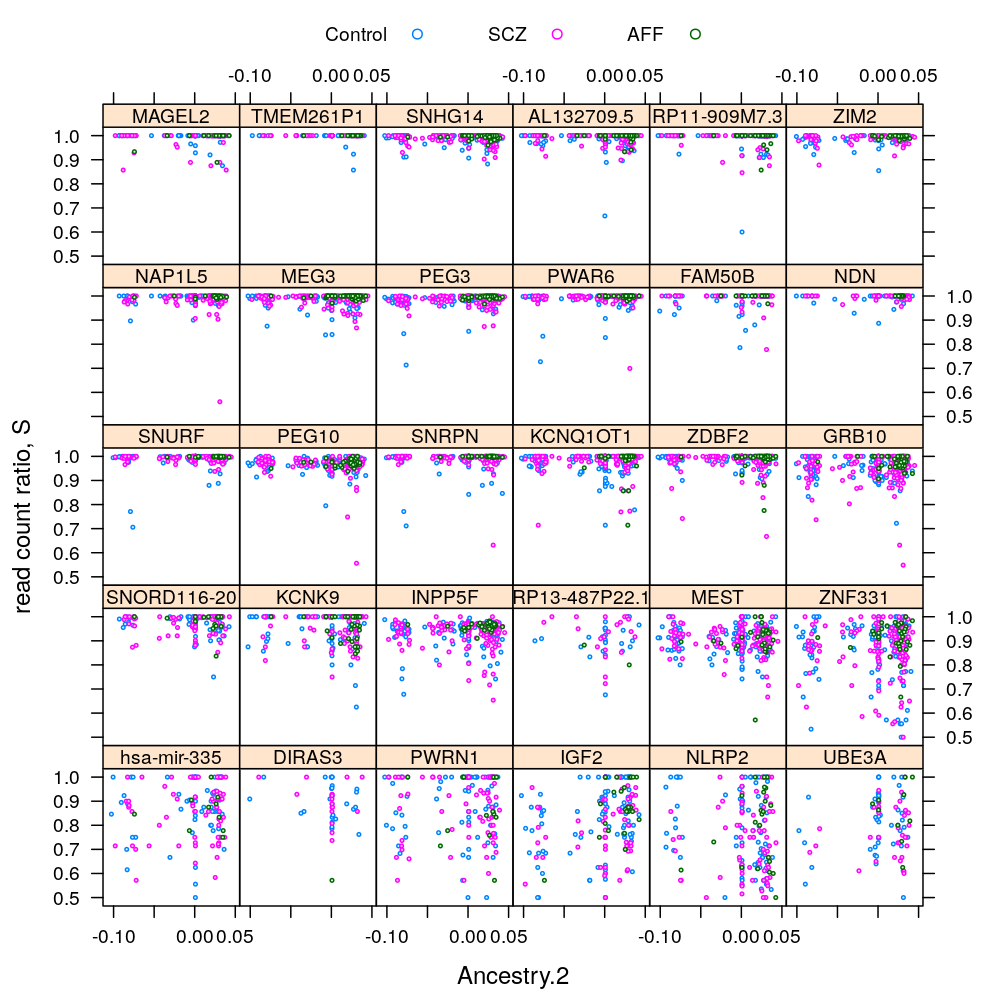
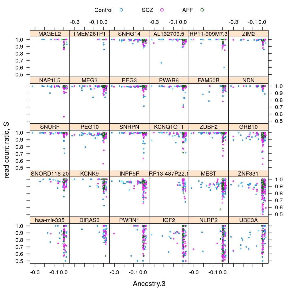
statistic
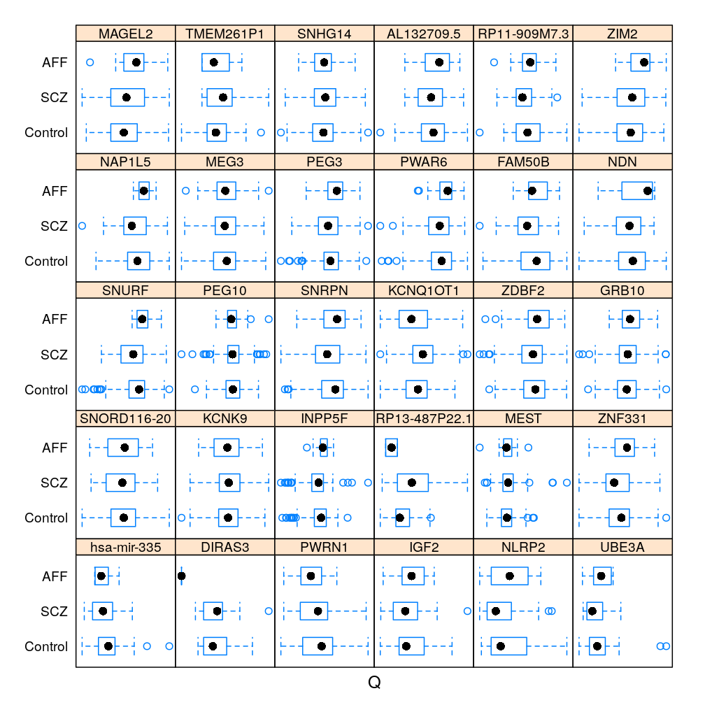
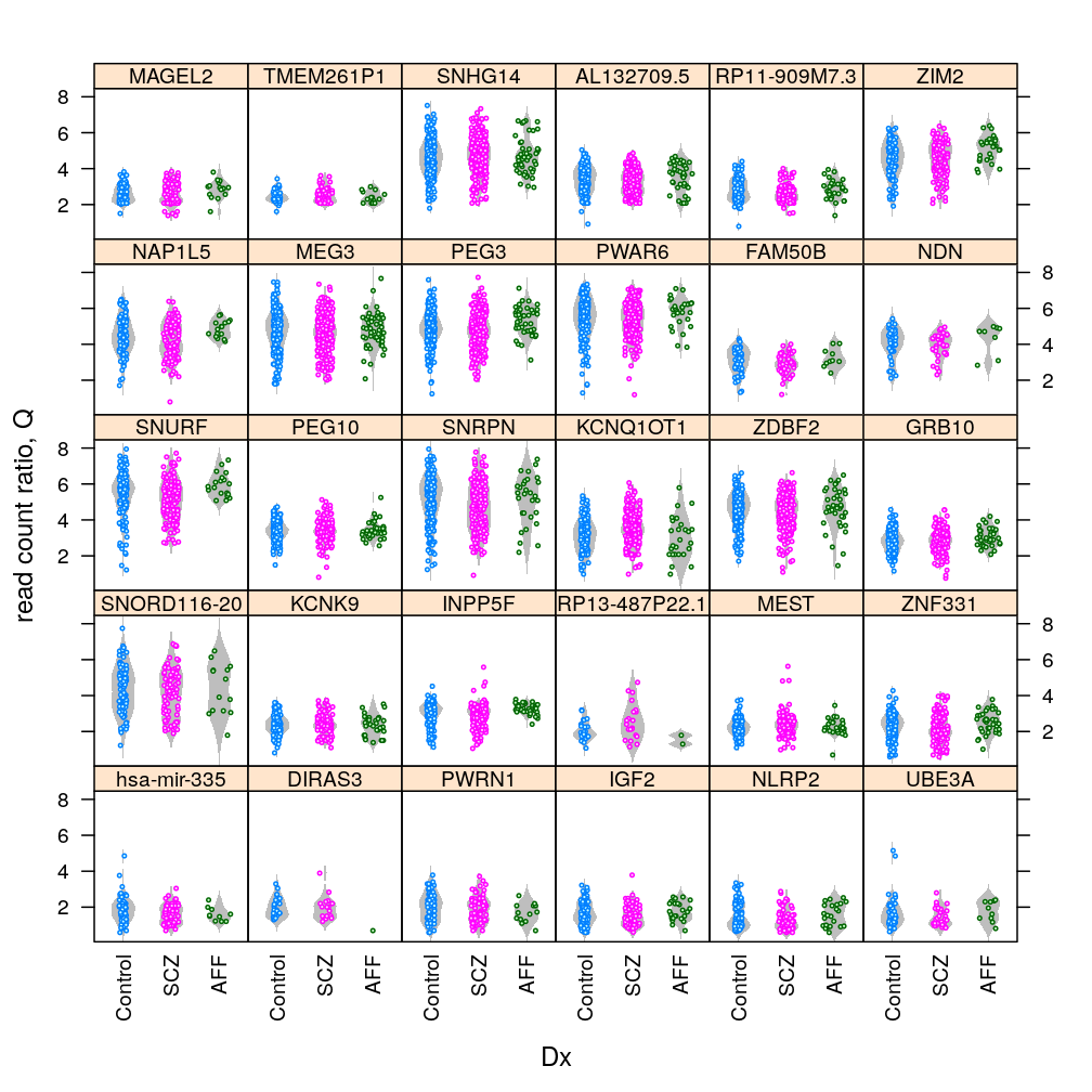
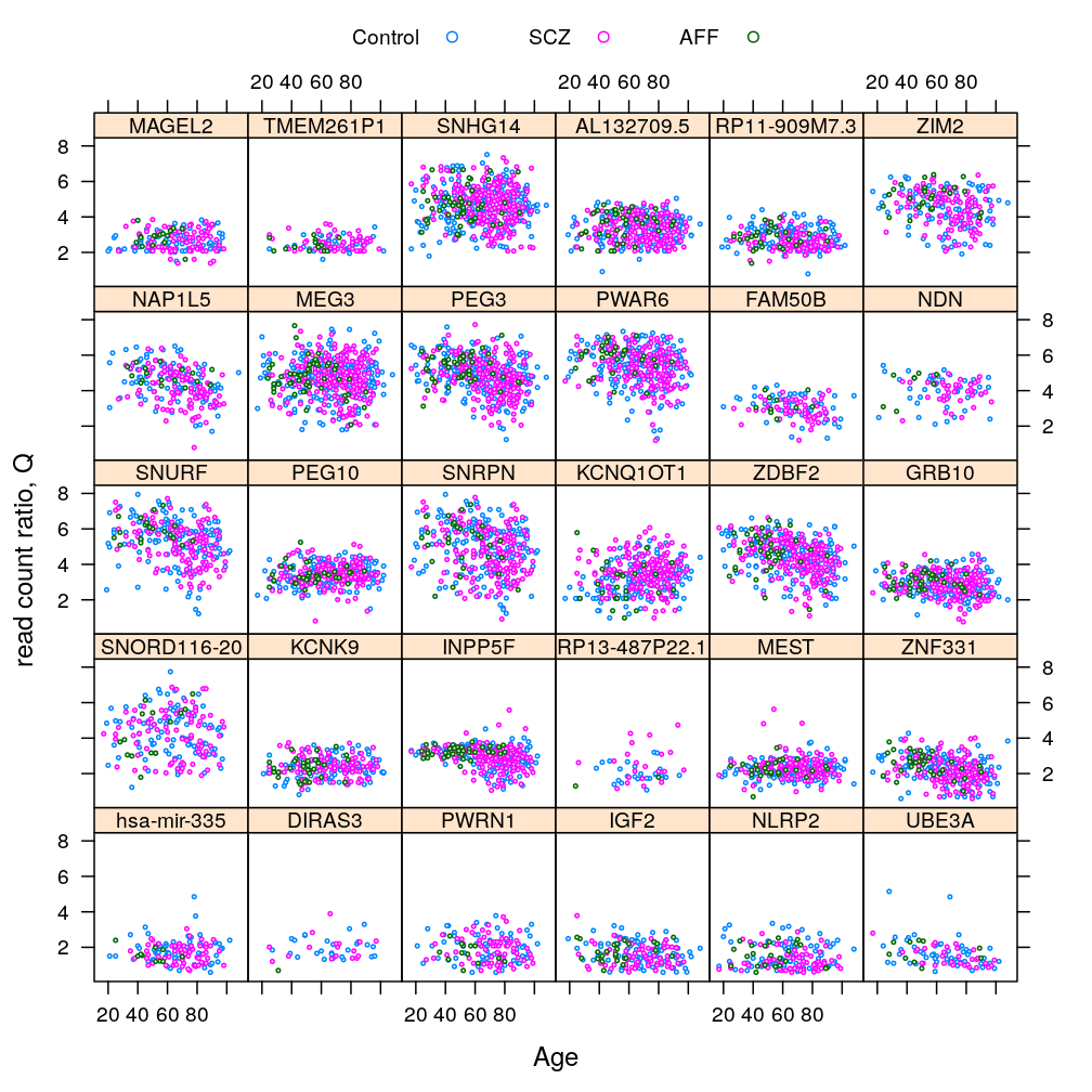
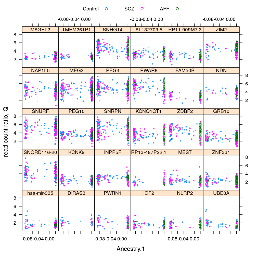
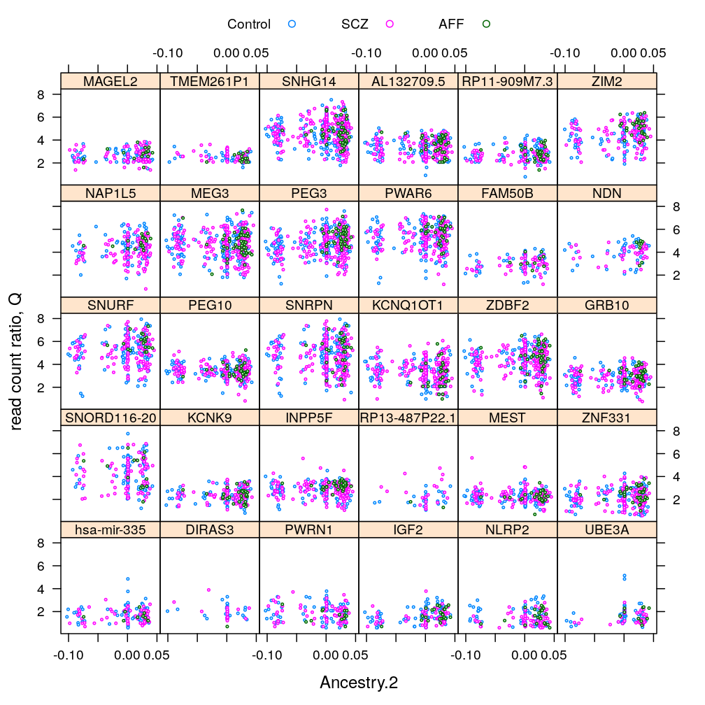
Only with MEST, the most significantly affected gene by Dx (see a later post), conditioning on various RIN intervals
Correlation and gene proximity
gs <- read.csv("../../results/gene-clusters.csv", row.names = 1)[-1 * 2:14]
gs.sel <- gs[as.character(read.csv("../../data/genes.regression.new")[ , 1, drop = TRUE]), -1 * c(1, 6) ]
gs.sel$Gene <- factor(rownames(gs.sel), levels = rownames(gs.sel), ordered = TRUE)
gs.sel <- gs.sel[with(gs.sel, order(seg, start)), ]
gs.sel[c("cluster", "start", "gene.type")]
##                        cluster     start      gene.type
## DIRAS3          clus 2 (chr 1)  68511644 protein_coding
## ZDBF2           clus 4 (chr 2) 207139386 protein_coding
## NAP1L5          clus 5 (chr 4)  89617065 protein_coding
## FAM50B          clus 7 (chr 6)   3849619 protein_coding
## GRB10          clus 11 (chr 7)  50657759 protein_coding
## PEG10          clus 13 (chr 7)  94285636 protein_coding
## MEST           clus 14 (chr 7) 130126011 protein_coding
## hsa-mir-335    clus 14 (chr 7) 130135634      antisense
## KCNK9          clus 17 (chr 8) 140613080 protein_coding
## INPP5F        clus 19 (chr 10) 121485608 protein_coding
## IGF2          clus 20 (chr 11)   2150341 protein_coding
## KCNQ1OT1      clus 20 (chr 11)   2629557      antisense
## MEG3          clus 27 (chr 14) 101245746        lincRNA
## AL132709.5    clus 27 (chr 14) 101403737        lincRNA
## RP11-909M7.3  clus 27 (chr 14) 101433988        lincRNA
## MAGEL2        clus 28 (chr 15)  23888690 protein_coding
## NDN           clus 28 (chr 15)  23930564 protein_coding
## PWRN1         clus 28 (chr 15)  24738283        lincRNA
## SNRPN         clus 28 (chr 15)  25068793 protein_coding
## SNURF         clus 28 (chr 15)  25200132 protein_coding
## PWAR6         clus 28 (chr 15)  25277019        lincRNA
## SNORD116-20   clus 28 (chr 15)  25332807        lincRNA
## TMEM261P1     clus 28 (chr 15)  25414483     pseudogene
## SNHG14        clus 28 (chr 15)  25497371         snoRNA
## UBE3A         clus 28 (chr 15)  25582380 protein_coding
## RP13-487P22.1 clus 28 (chr 15)  25590779 sense_intronic
## ZNF331        clus 32 (chr 19)  54024234 protein_coding
## NLRP2         clus 32 (chr 19)  55464497 protein_coding
## ZIM2          clus 32 (chr 19)  57285919 protein_coding
## PEG3          clus 32 (chr 19)  57321444 protein_coding
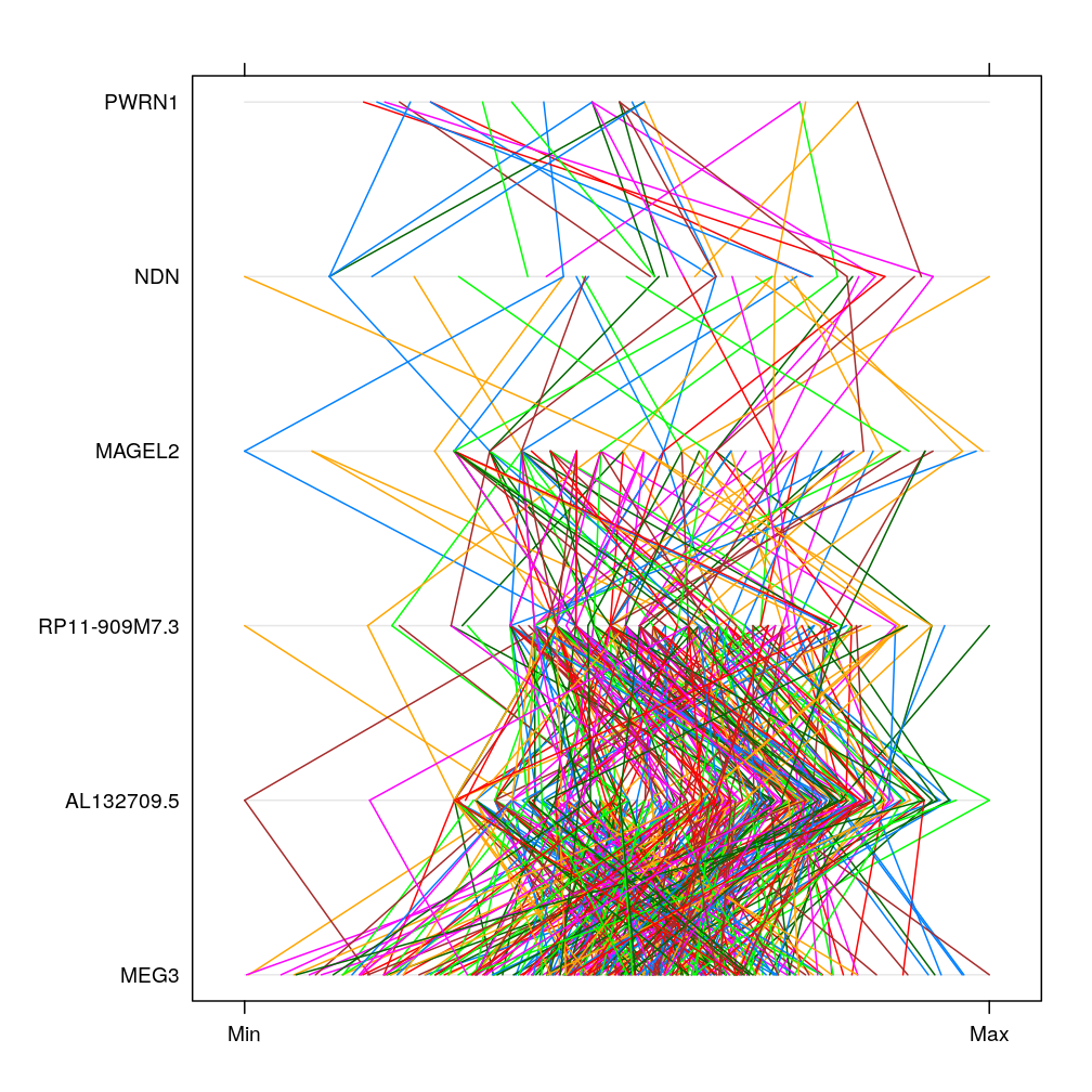
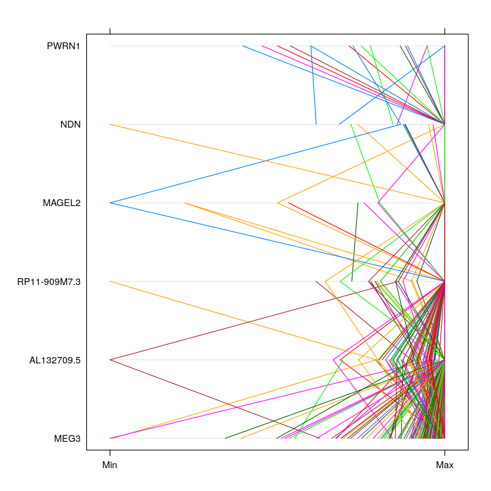
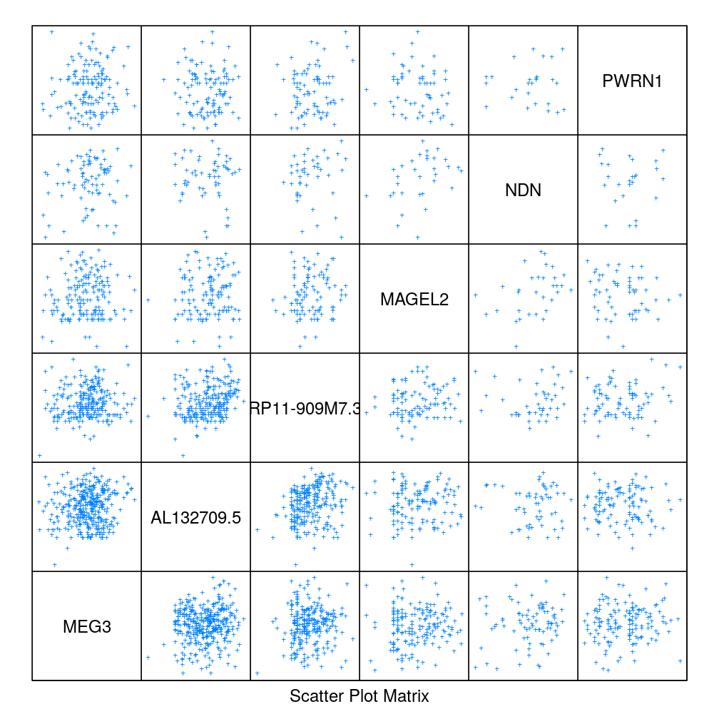
Select 3-3 consecutive genes in cluster 27 (chr 14) and 28 (chr 15), respectively. Produce scatter plot matrix as well as parallel plot first using the statistic and then the statistic. These plots show no clear pattern in which correlation would depend on gene proximity.
statistic
sel.g <- as.character(gs.sel[gs.sel$seg %in% c(27, 28), "Gene"])[1:6]
splom(m <- sapply(get.readcounts(gene.ids)[sel.g], getElement, "S"), pch = "+", pscales = 0)
parallelplot(m)
statistic
splom(m <- sapply(get.readcounts(gene.ids)[sel.g], getElement, "Q"), pch = "+", pscales = 0)
parallelplot(m)
