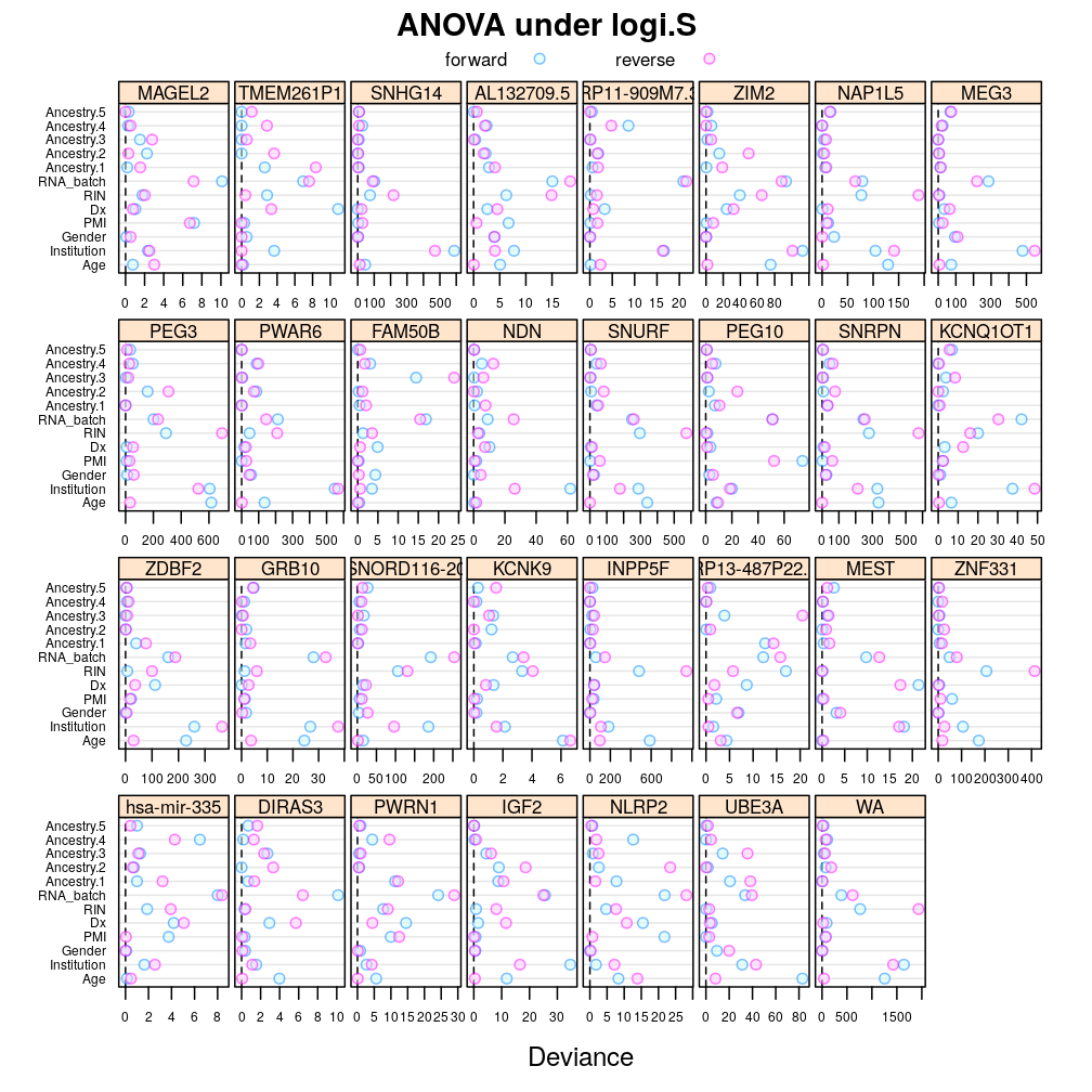
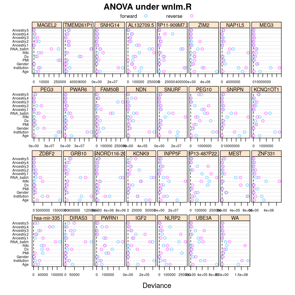
The analysis presented here follows up on the previous ANOVA and extends it in two ways:
- terms, corresponding to predictors, are added in various sequences
- more genes (see the preceding post)
The present analysis has been extended several times over the time. In particular, it depends on the model checking results presented in a subsequent post (see Model Checking).
Introduction
ANOVA and effects were used before…TODO
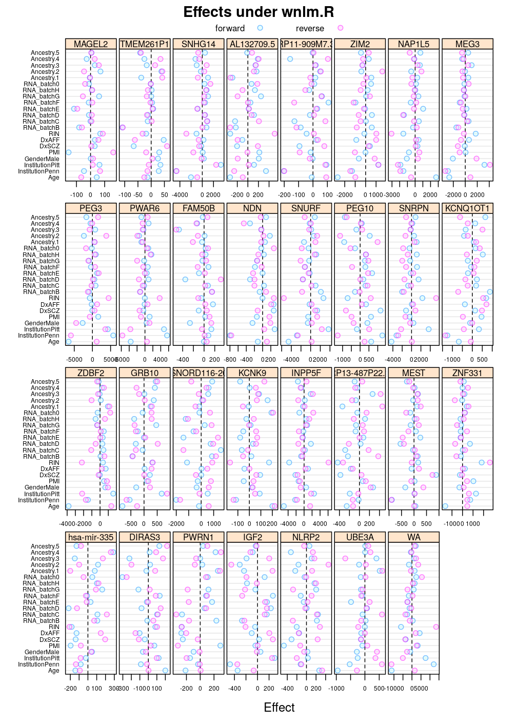
The least square estimates are given by . Permuting the coefficients is equivalent to permuting the bases of the linear transformation or, equivalently, permuting the rows of the corresponding matrix or, equivalently again, permuting the columns of the design matrix. Therefore, when explanatory variables are reordered and the columns of the design matrix are permuted accordingly then the least square estimates still remain the same up to their relative order.
Take two permutations of explanatory variables:
- forward has been used in all my and Ifat’s previous analysis
- the reverse of the above
Preparation
Relevant scripts
## Loading required package: RColorBrewer
Import data; note that the set of selected genes have been updated based on later analysis
E <- get.predictors() # default arguments
# updated gene set
gene.ids <- unlist(read.csv("../../data/genes.regression.new", as.is = TRUE))
names(gene.ids) <- gene.ids
Y <- get.readcounts(gene.ids = gene.ids, count.thrs = 0)
#nobs <- as.data.frame(lapply(list(unfiltered=Y, filtered=Y.f), function(y) sapply(y, function(x) sum(! is.na(x[[1]])))))
Fit wnlm.Q, wnlm.R and logi.S using both the forward and the reverse order permutation.
# e.vars defined in fit-glms.R
e.v <- list(forward = e.vars, reverse = rev(e.vars))
# exclude unweighed aggregates UA.8 and UA from fitting
to.fit.ids <- grep("^UA(.8)?$", names(Y), value = TRUE, invert = TRUE)
to.fit.ids <- grep("^WA.8$", to.fit.ids, value = TRUE, invert = TRUE)
M <- lapply(list(unlm.Q = "unlm.Q", wnlm.Q = "wnlm.Q", unlm.R = "unlm.R", wnlm.R = "wnlm.R", logi.S = "logi.S", logi2.S = "logi2.S"),
            function(m) lapply(e.v,
                               function(v) do.all.fits(Y[to.fit.ids], preds = v, sel.models = m)[[1]]))
# a list of (sub)lists mirrioring the structure of M (sublists: forward or reverse)
f.ids <- lapply(M, lapply, function(m) ! sapply(m, is.null))
# the fit for TMEM261P1 has not converged under logi.S
f.ids$logi.S$forward["TMEM261P1"] <- FALSE
f.ids$logi.S$reverse["TMEM261P1"] <- FALSE
Consistent with the theory above, wherever the fit converged (with the exception of TMEM261P1), the order has no impact on the regression coefficients. The next R expression compares coefficient estimates between forward and reverse under logi.S for every gene or aggregate and reports any difference:
grep("TRUE", sapply(to.fit.ids, function(g) all.equal(coef(M$logi.S$forward[[g]]), coef(M$logi.S$reverse[[g]])[ names(coef(M$logi.S$forward[[g]])) ])), invert = TRUE, value = TRUE)
## named character(0)
Components of variation
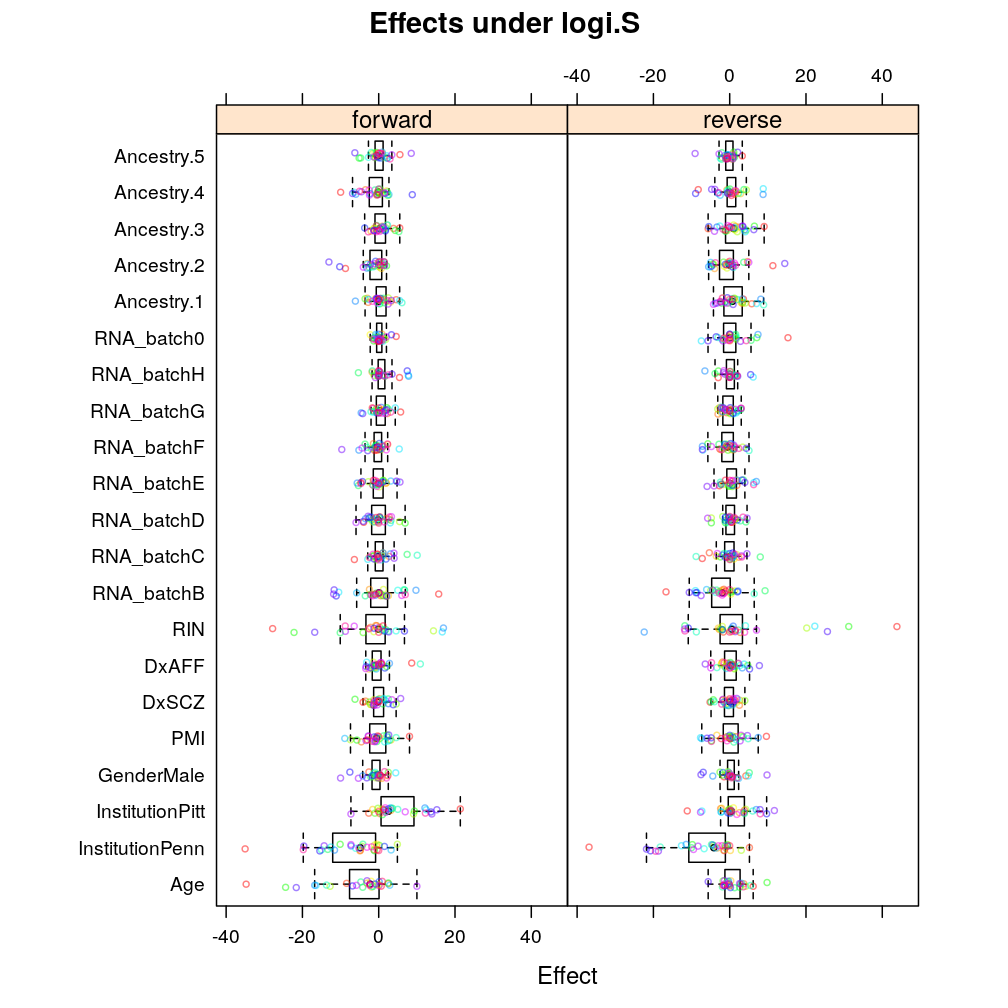
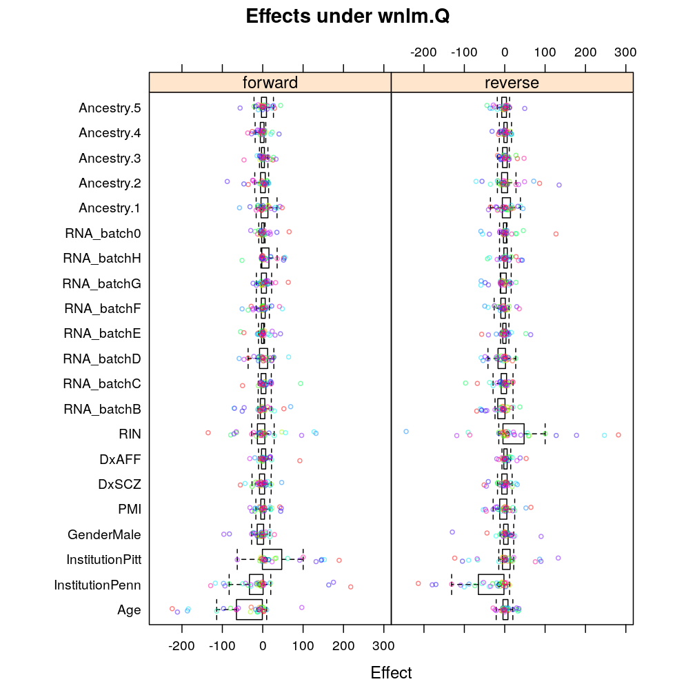
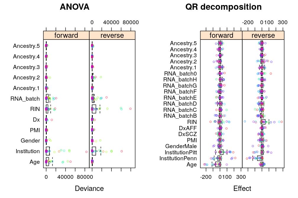
ANOVA allows direct comparison of predictors (explanatory variables) by partitioning all explained/systematic variation in the response ( or ) among them. Similarly, the directly comparable effect of each of the regression coefficients on the response (an -vector) can be obtained from QR decomposition of the response into a set of orthogonal vectors, in which a subset of vectors corresponds to the coefficients.
In the above sentences “directly comparable” means that the effects are on a uniform scale for all predictors/coefficients for a given gene as that scale is closely related to the one on which the response varies. But the total variation of the response itself shows variation across genes, which leaves two options in gene-gene comparisons: compare components of variation with or without correction for across gene variation of the total variance. The first one will be referred below as genes on uniform scale and the second as genes on relative scale.
Comparing predictors with genes on uniform scale
A.long <- lapply(lapply(M, lapply, l.anova), reshape.2, type = "anova")
Under logi.S:
## $anova.logi.S
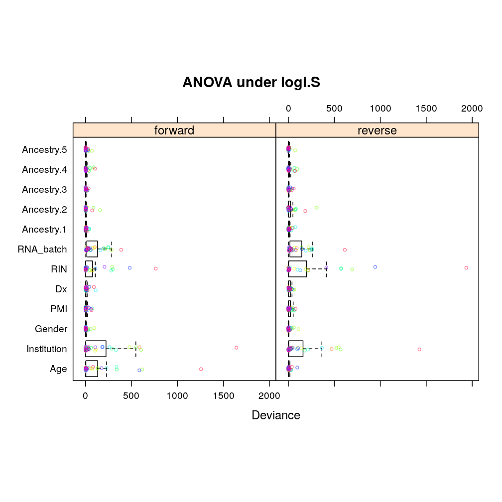
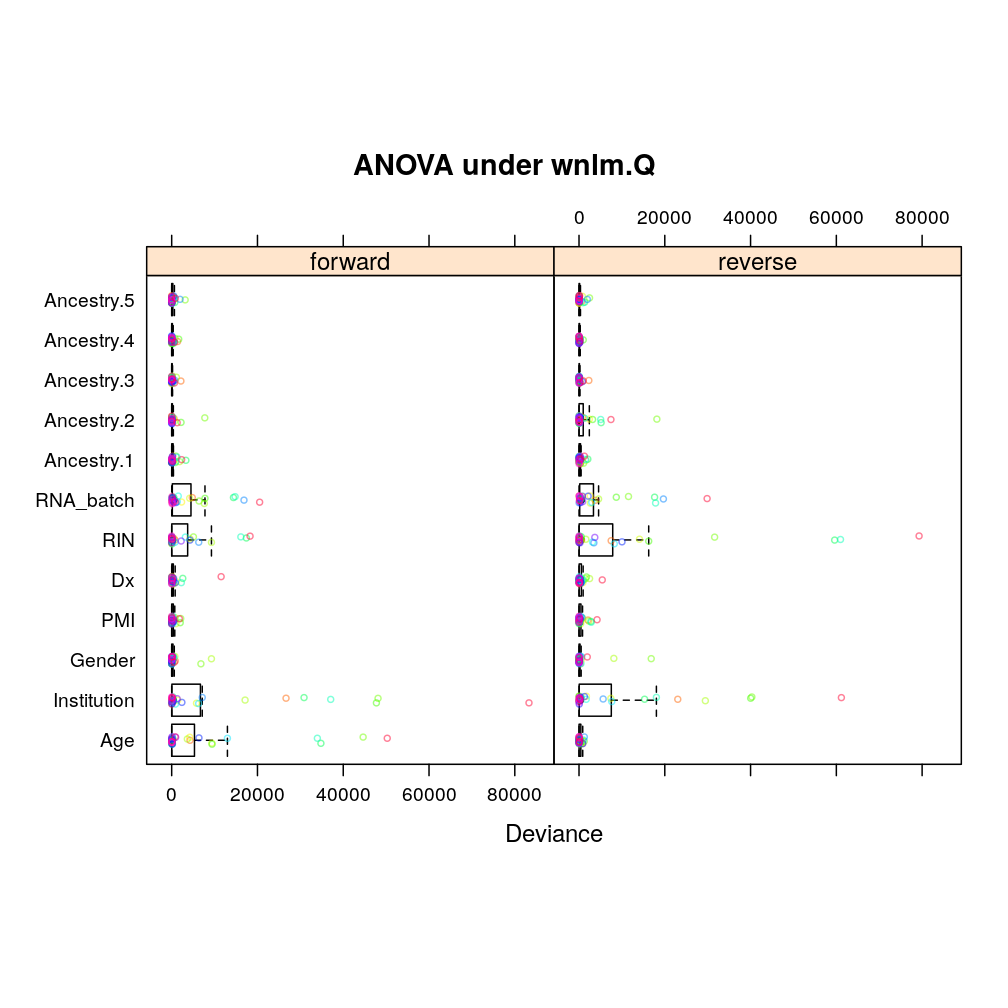
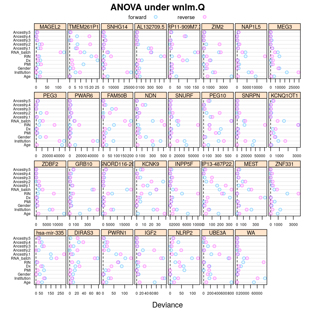
The same tendencies emerge under wnlm.Q:
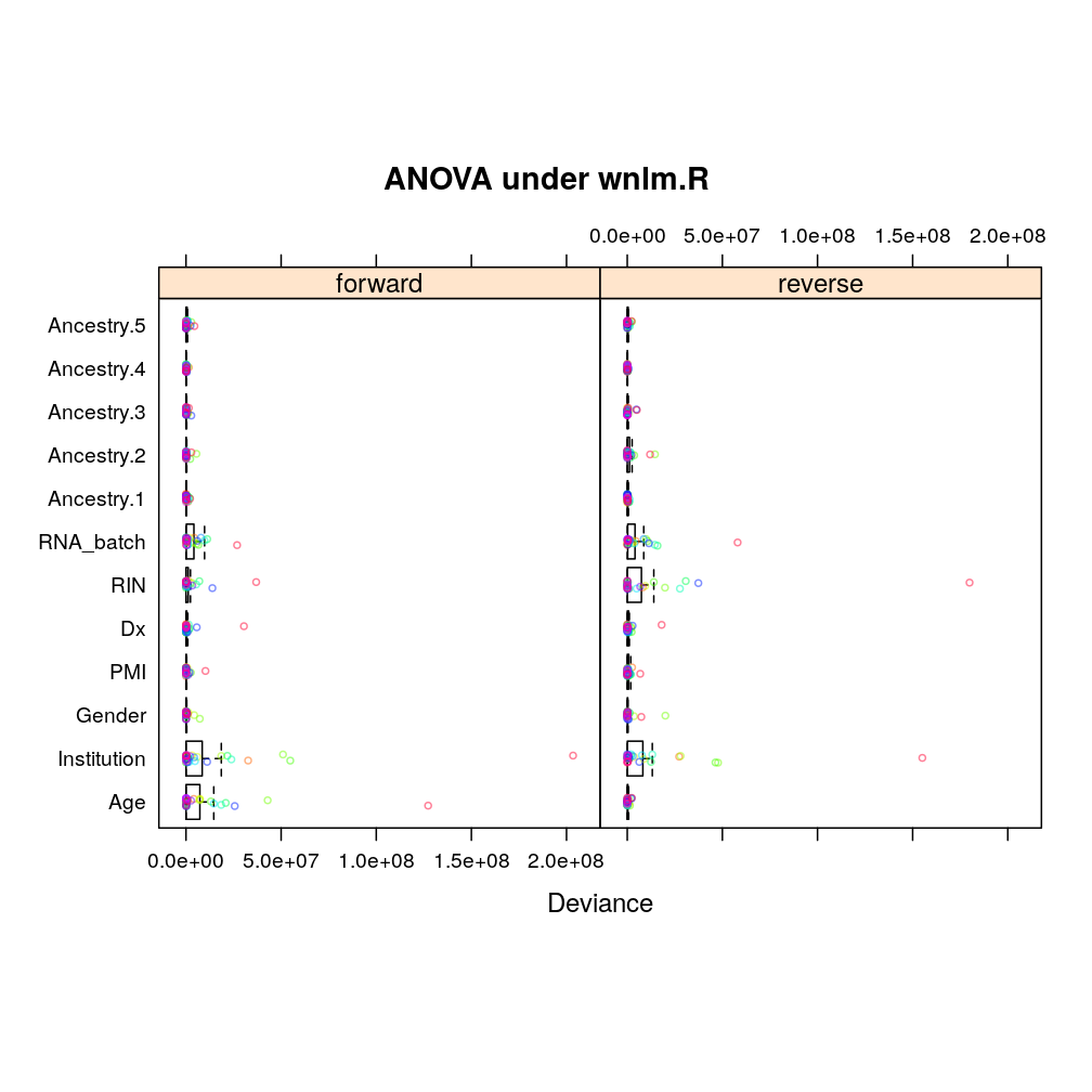
Similarly under wnlm.R:
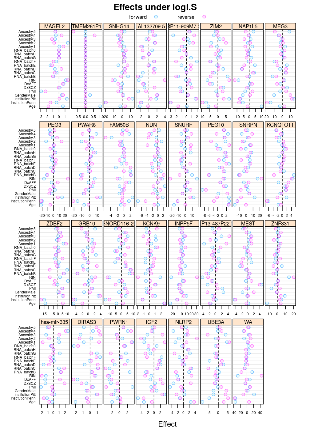
Ef.long <- lapply(M, function(m) { x <- l.l.effects(m); x <- x[ ! x$Coefficient %in% "(Intercept)", ] })
Under logi.S:
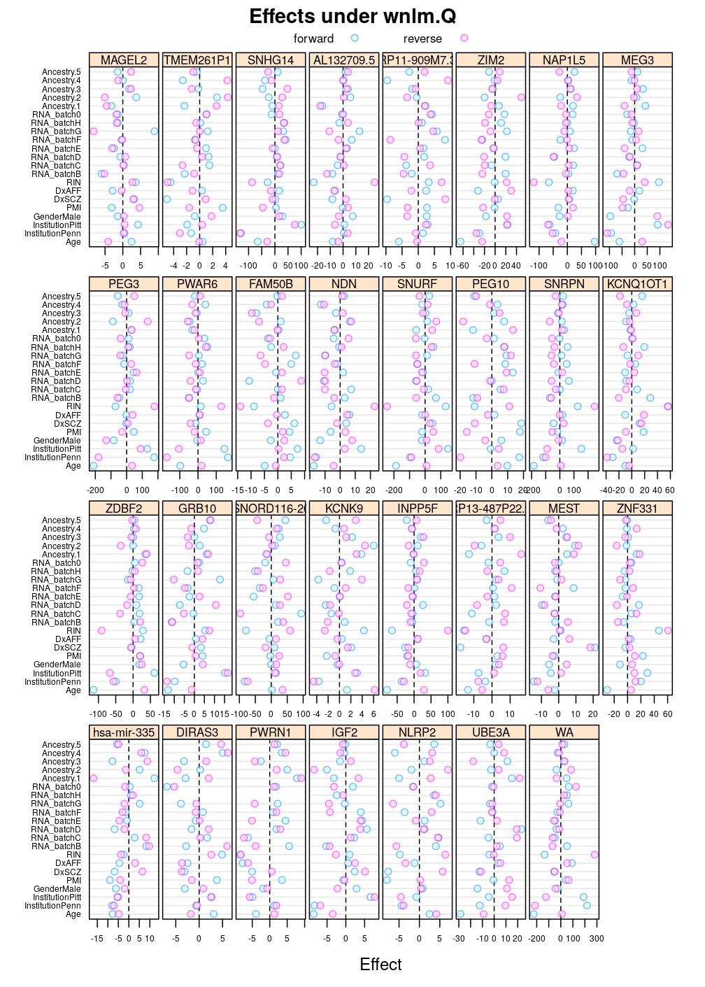
Again, similar tendencies are observed under wnlm.Q:
Similarly under wnlm.R:
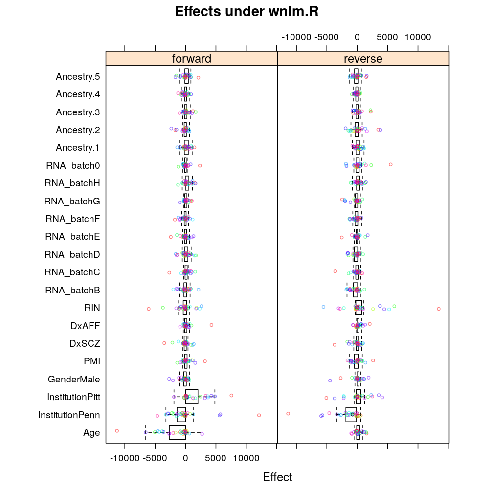
Figure for manuscript
Comparison with genes on relative scale
Another view, genes on uniform scale
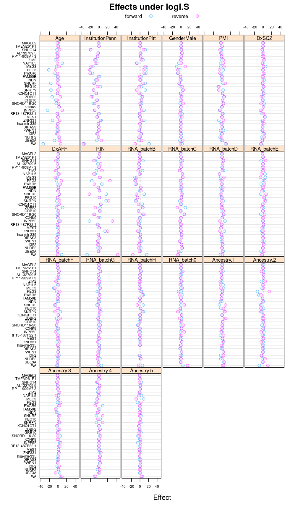
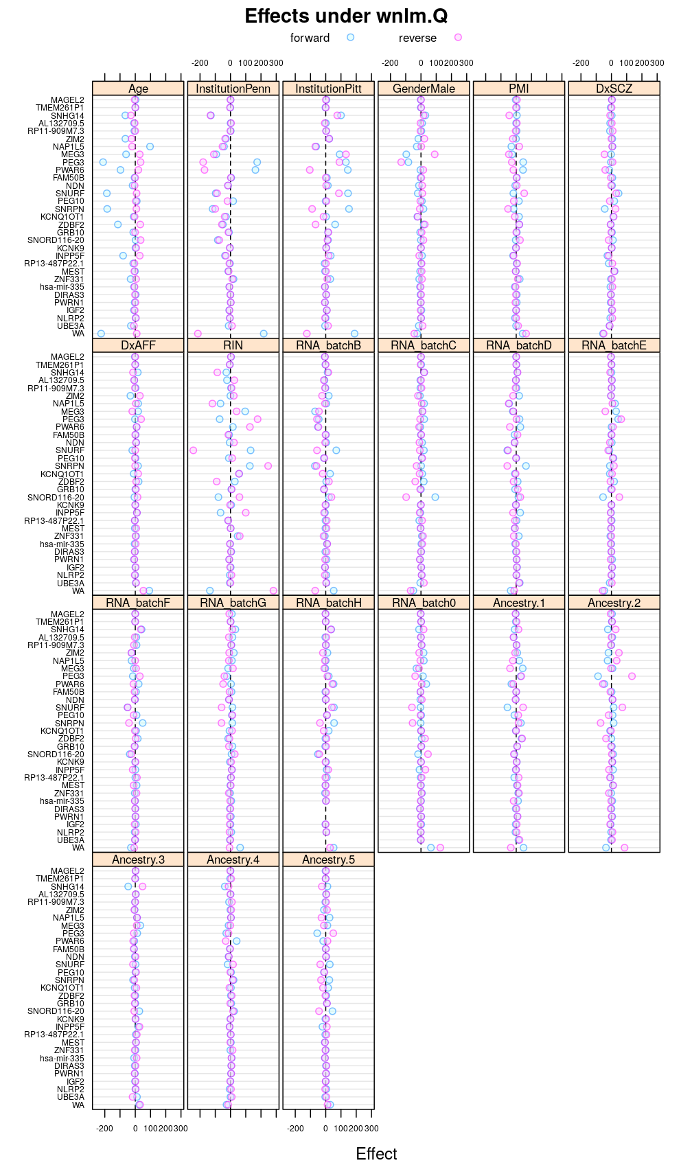
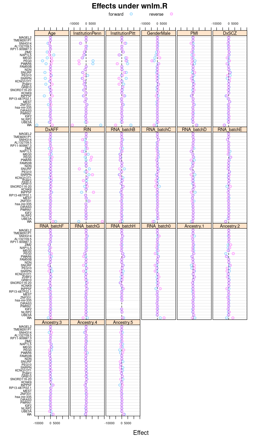
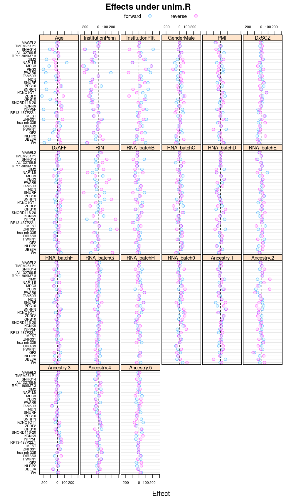
This display is meant to be comparable to a similarly structured trellis display of estimated regression coefficients.
Under logi.S
Under logi2.S

Under wnlm.Q
Under unlm.Q
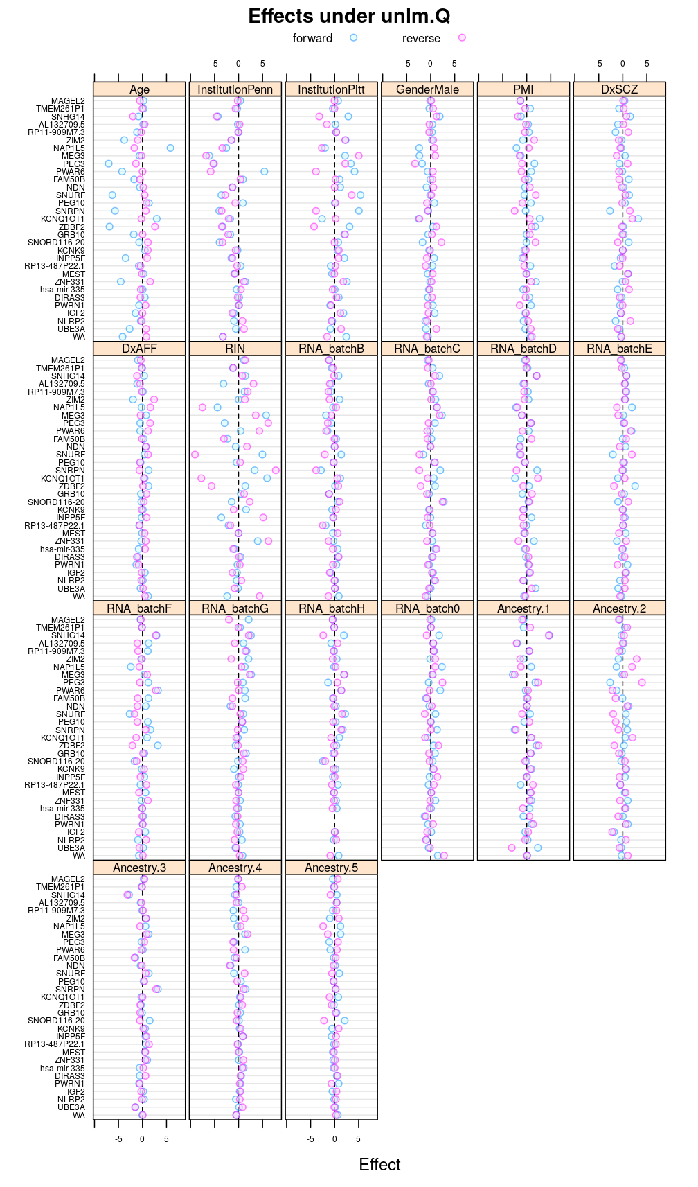
Under wnlm.R
Under unlm.R
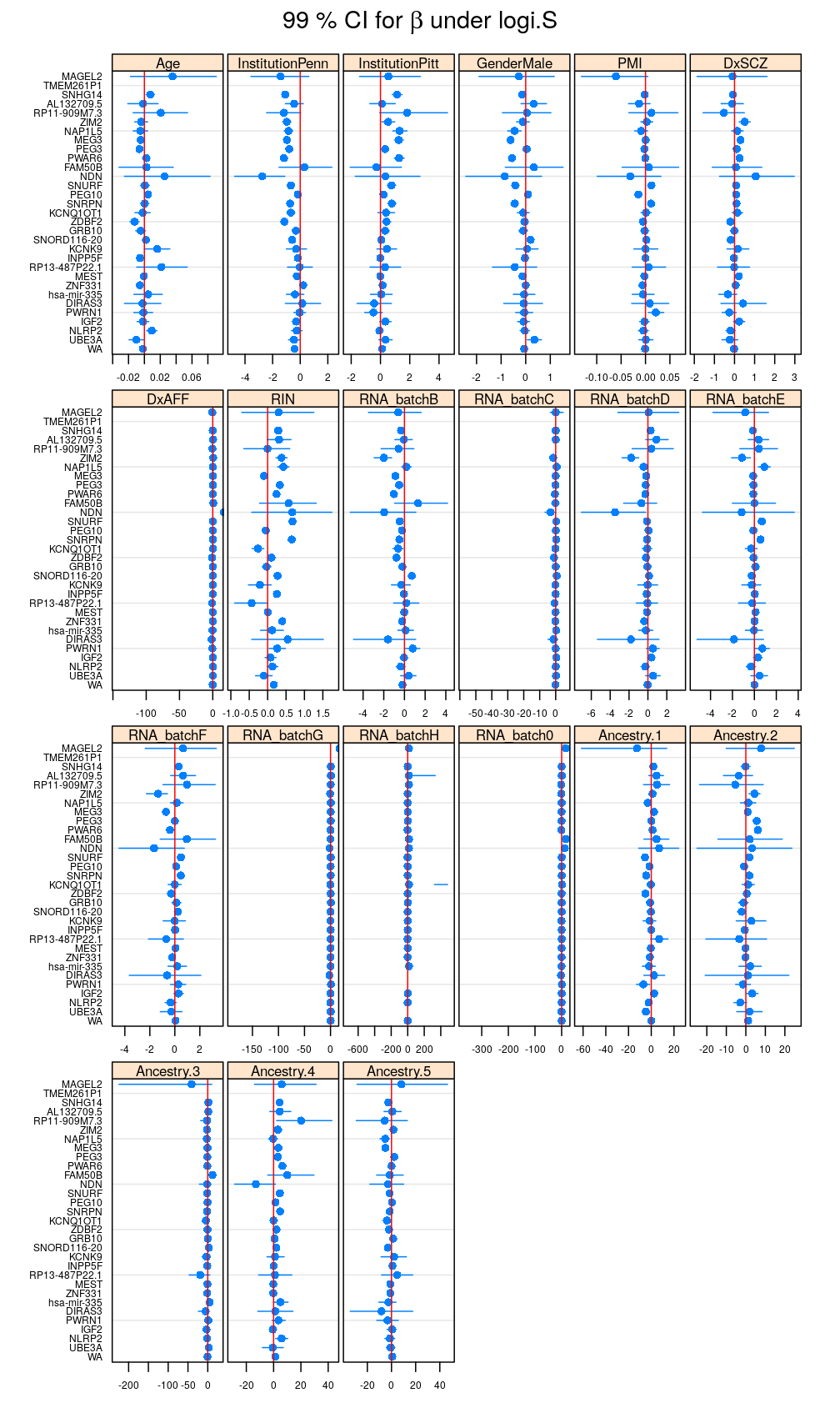
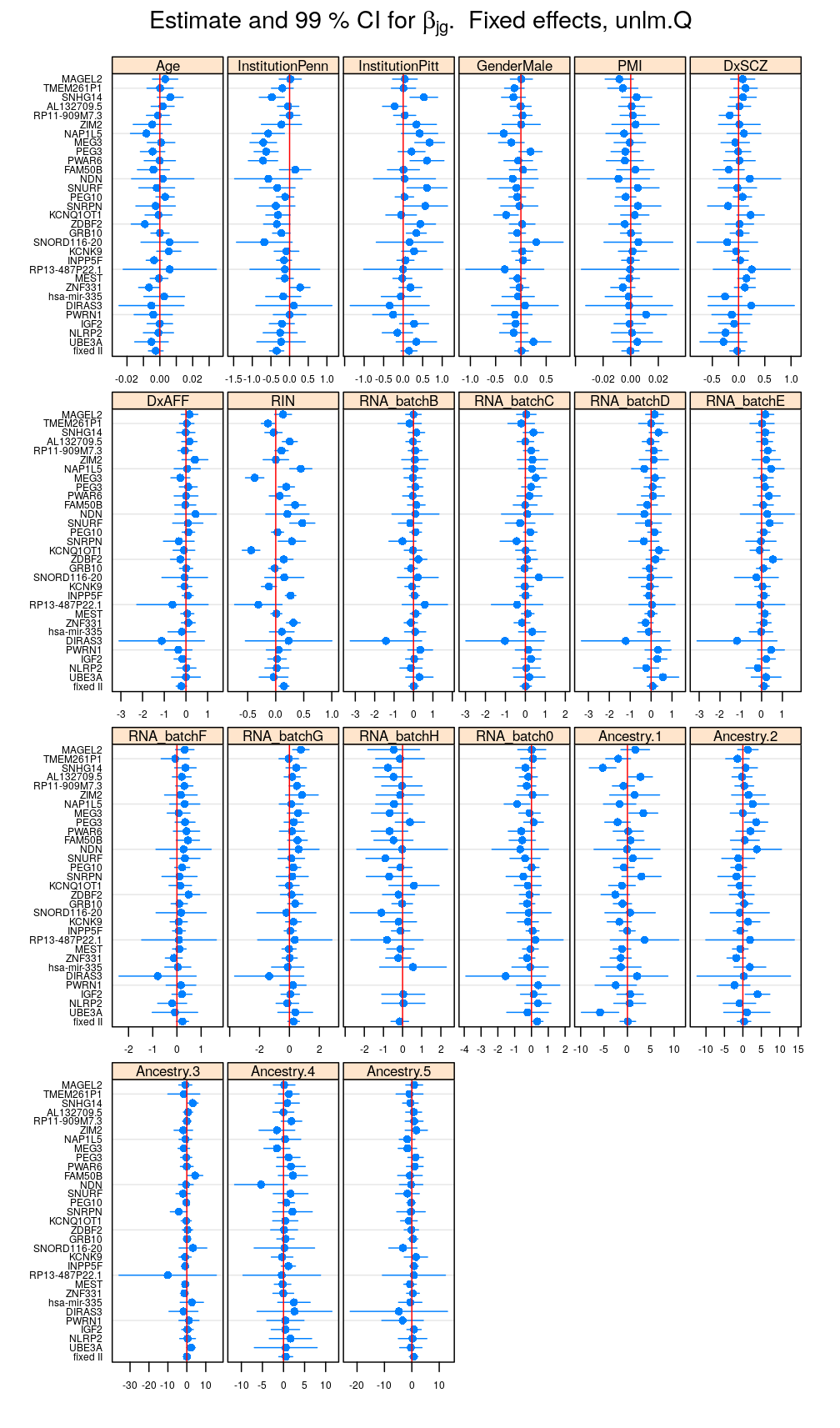
Estimate and CI for regression coefficients
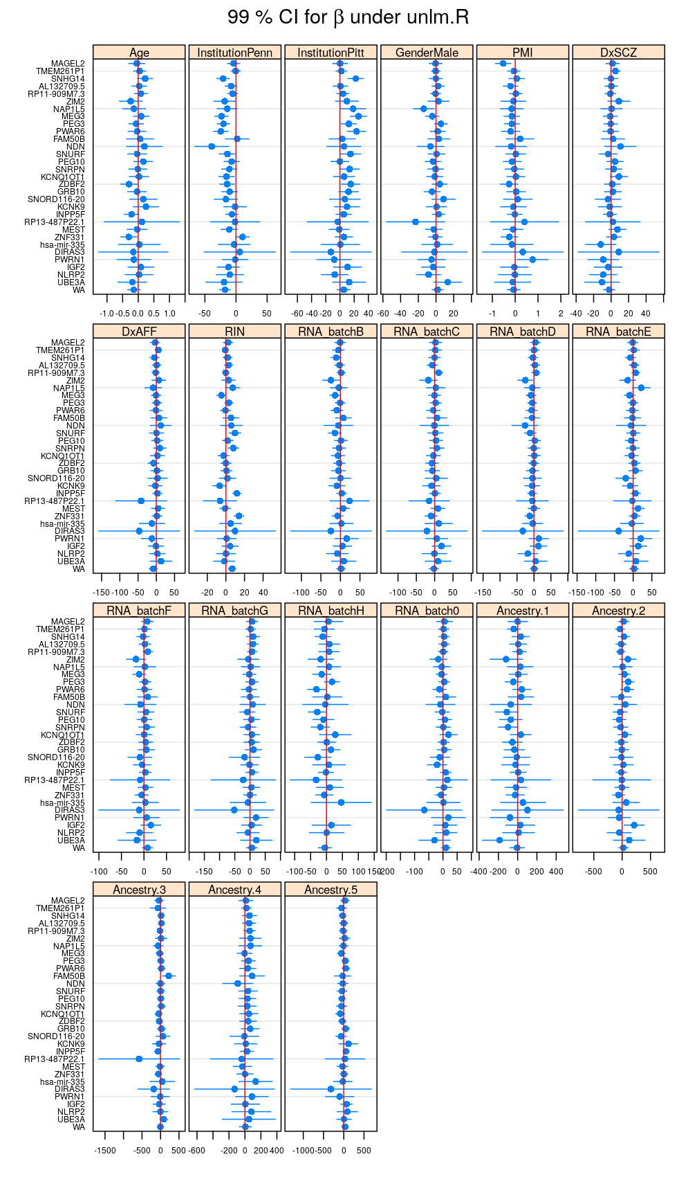
This and the next section do not deal with analysis of variance specifically but rather with the estimated regression coefficient for each column of the design matrix and for each gene . But because of computational convenience these are presented here.
Betas <- lapply(M, function(m) { x <- get.estimate.CI(m$forward); x <- x[ ! x$Coefficient %in% "(Intercept)", ] })
Betas.long <- do.call(rbind, lapply(names(Betas), function(x) cbind(Betas[[x]], data.frame(Model = x))))
write.csv(Betas.long, "../../results/beta-99-CI.csv")
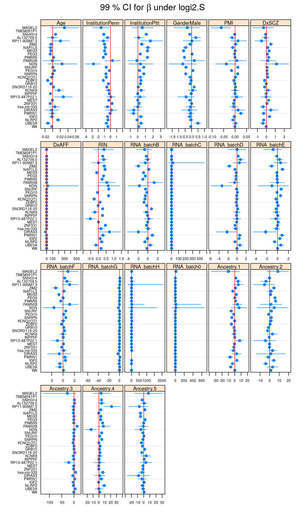
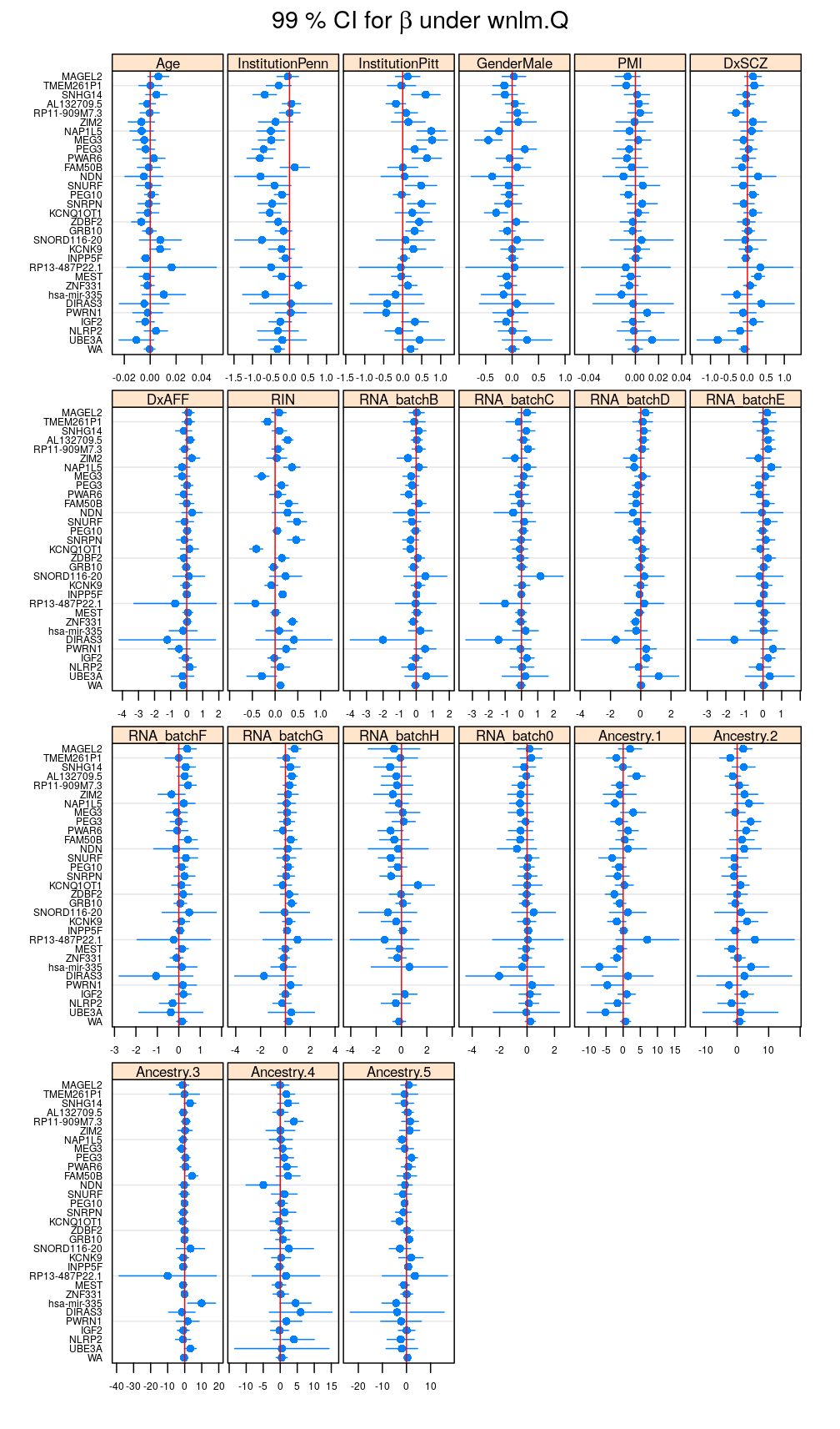
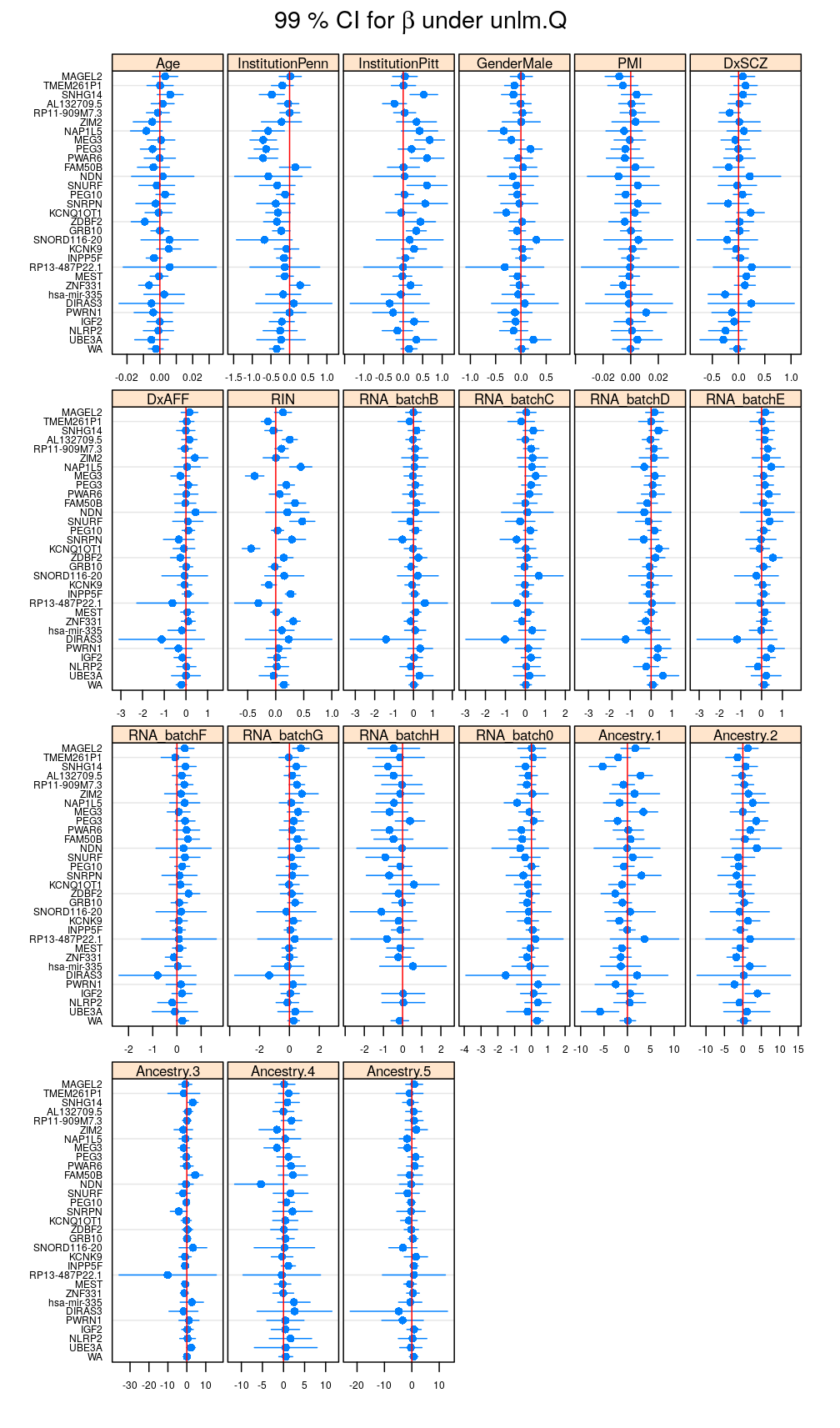
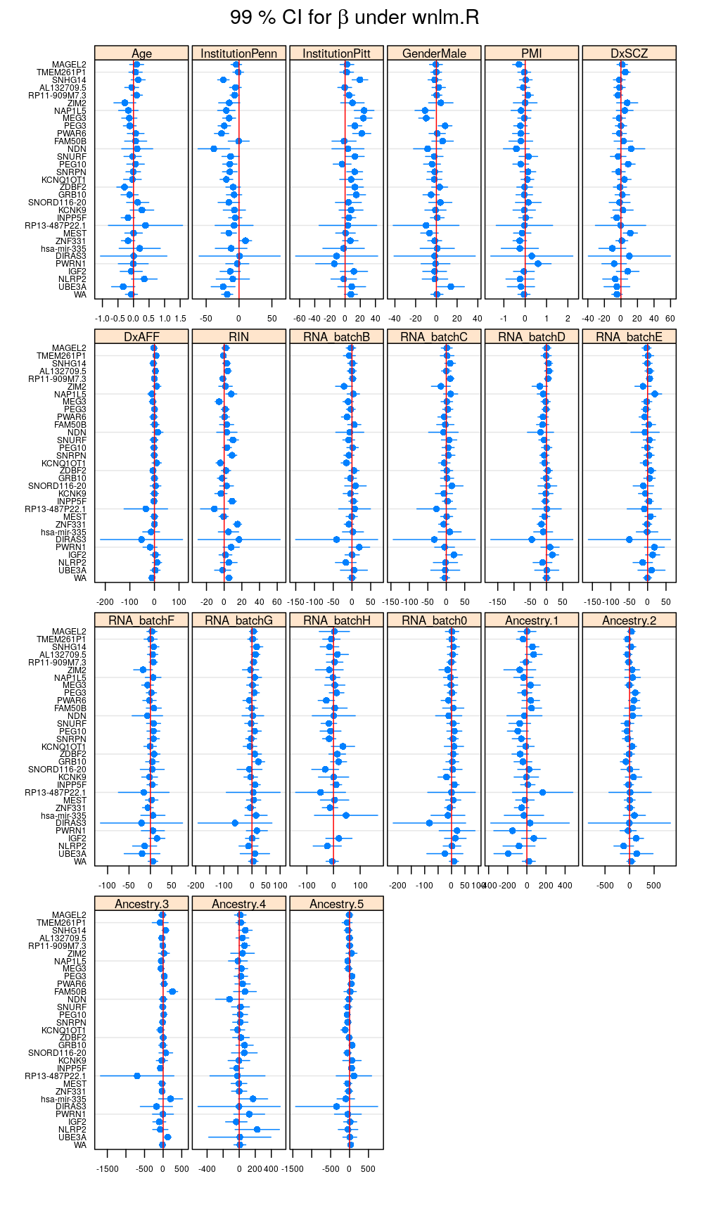
my.segplot(data = reverse.genes(Betas$logi.S), main = expression(paste("99 % CI for ", beta, " under logi.S")))
Filtering out results for logi.S if the fit is bad for a given gene, using decisions based on model checking analysis
logi.S.OK <- read.csv("../../results/model-checking.csv", row.names = "gene")["logi.S.fit.OK"]
# filter betas for logi.S
B.logi.S.f <- Betas$logi.S
B.logi.S.f[B.logi.S.f$Gene %in% c(rownames(logi.S.OK)[! logi.S.OK$logi.S.fit.OK], "WA"), c("Estimate", "Lower.CL", "Upper.CL")] <- NA
# filtered and unfiltered long format Betas
Betas.l.f <- Betas.l <- do.call(cbind, Betas)
# perform filtering by replacing data with NAs
Betas.l.f[Betas.l.f$logi.S.Gene %in% c(rownames(logi.S.OK)[! logi.S.OK$logi.S.fit.OK], "WA"), grep("logi\\.S\\.[ELU]", names(Betas.l.f))] <- NA
my.segplot(data = B.logi.S.f, xlim = my.xlim)
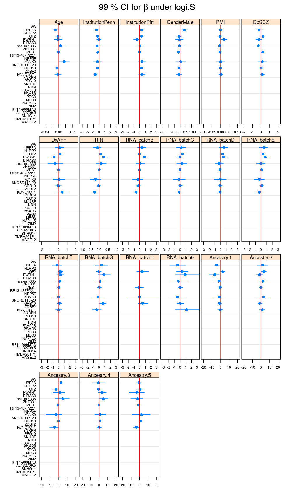
Figure for manuscript
Comparison of models
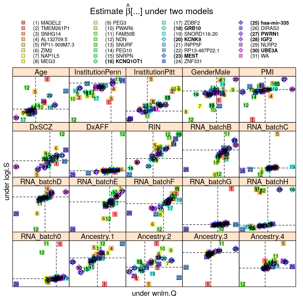
The pairwise model comparisons in terms of under either of two selected models are meant to assess sensitivity of the results to various aspects of modeling:
- logistic vs normal linear model
- scaling of the logit link function
- data transformations for the normal linear model: vs statistic
- weighting for the normal linear model
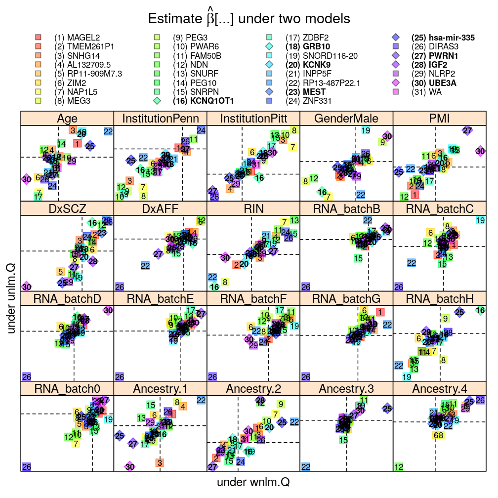
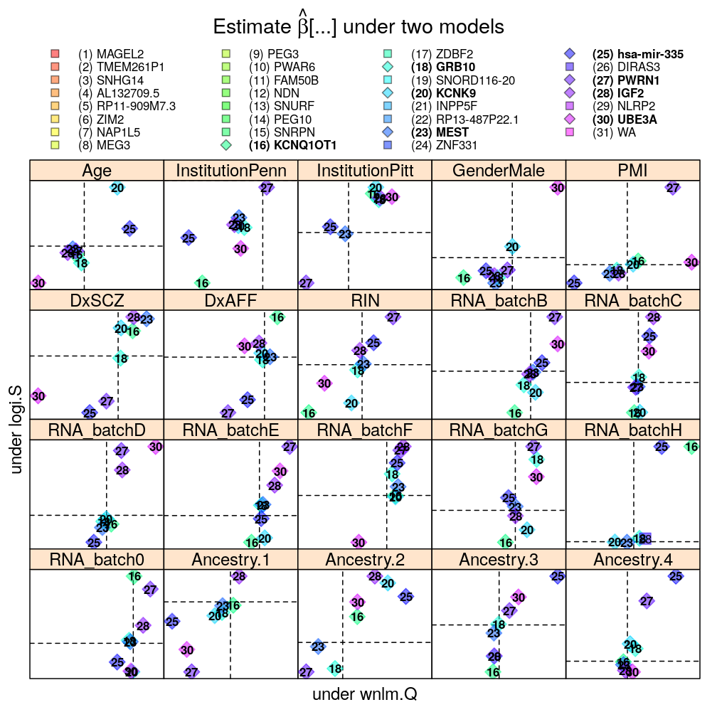
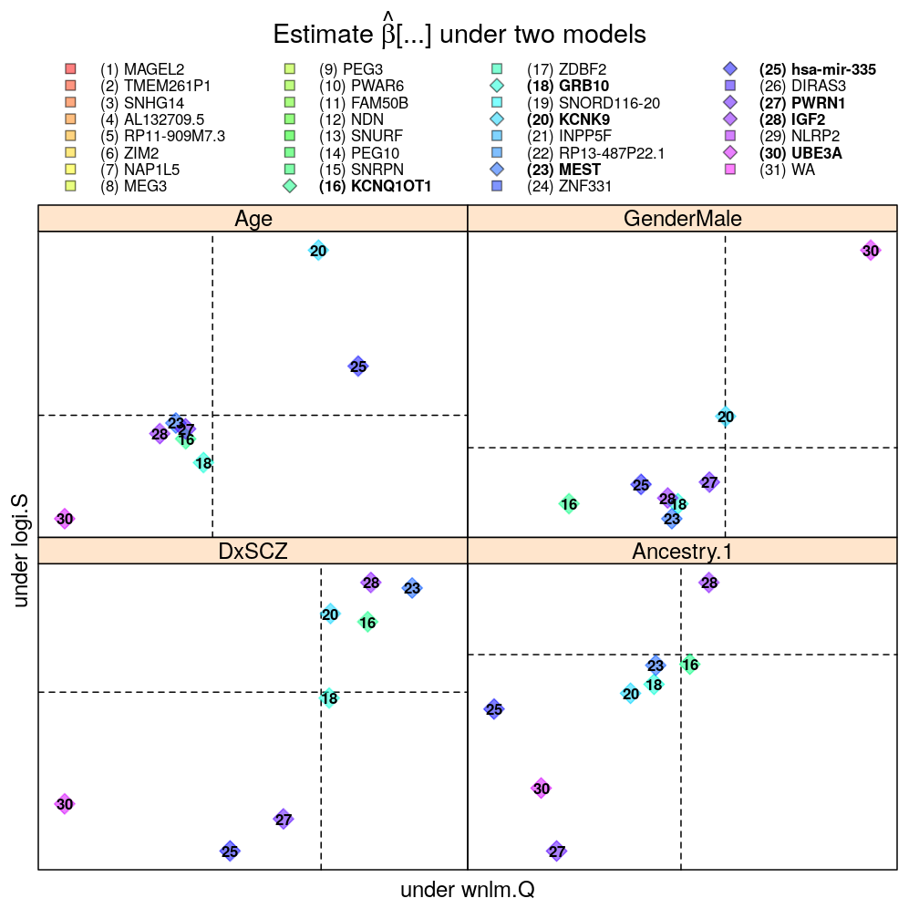
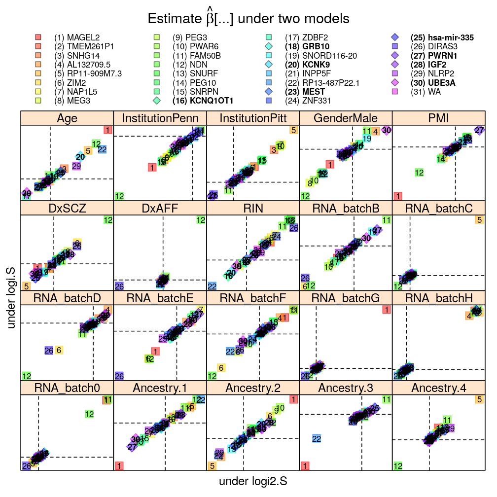
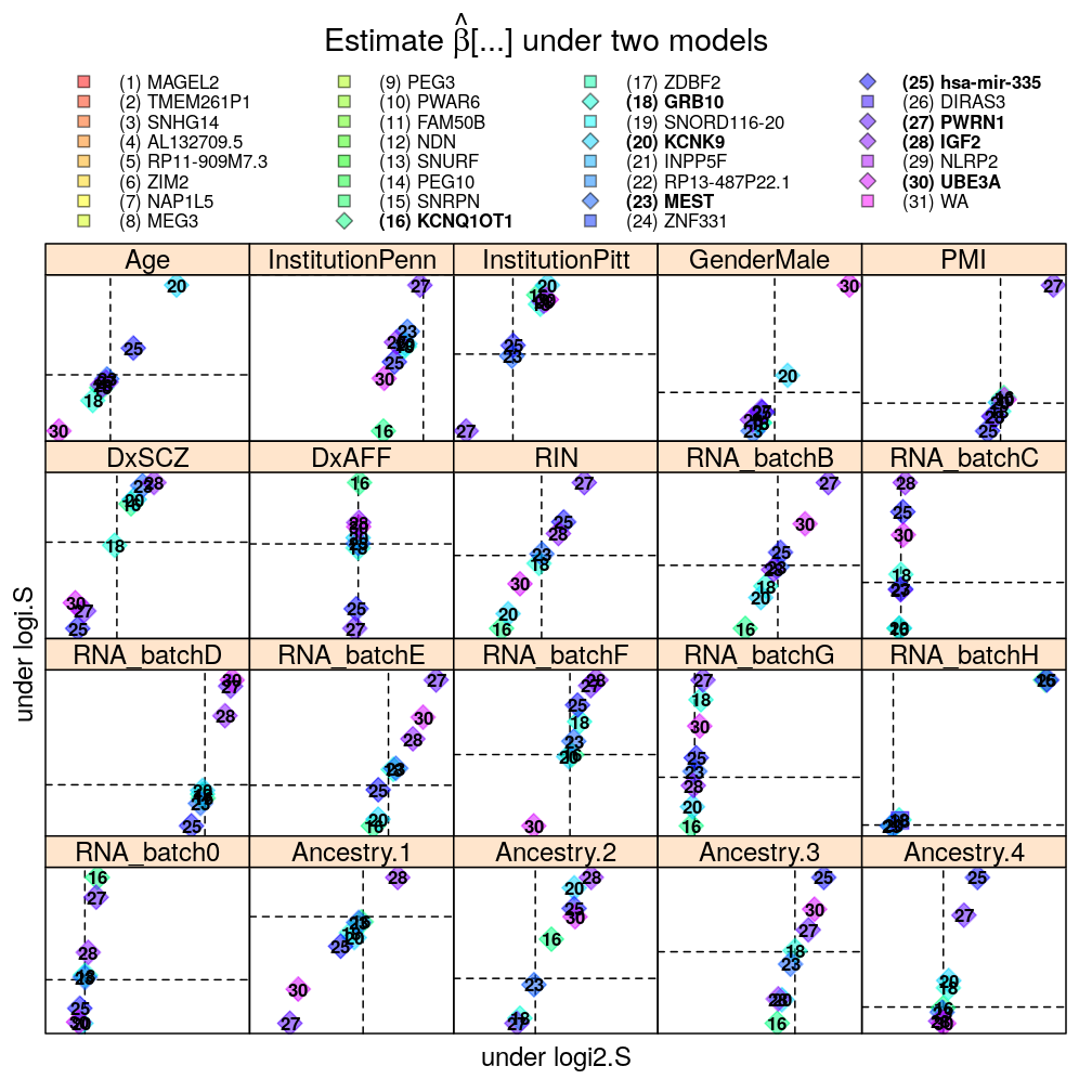
Each panel in the plot shows the theoretical zero line under each of the two models (horizontal and vertical dashed lines). The plotting symbols are color coded according to gene rank (rainbow, red to violet); the last “rank” #31 (violet) corresponds to the weighted average WA of read count ratio over genes. The plotting symbols also display the rank with numbers, see the key on the top. Genes acceptably fitted by both models are distinguished with a diamond symbol and bold font from those that could be fitted only by wnlm.Q.
Logistic vs normal linear model
The plot shows overall agreement between logi.S and wnlm.Q. Genes of disagreement tend to be those for which logi.S fits poorly to the data.
Without filtering genes with poor fit by logi.S
mtype.compare.plot(mtypeA = "logi.S", mtypeB = "wnlm.Q", dt = Betas.l, do.key = TRUE)
With filtering
mtype.compare.plot(mtypeA = "logi.S", mtypeB = "wnlm.Q", dt = Betas.l.f, do.key = TRUE)
Only for 4 biological predictors
mtype.compare.plot(mtypeA = "logi.S", mtypeB = "wnlm.Q", dt = Betas.l.f, do.key = TRUE)[c(1,4,6,17)]
Scaling of the logit link function
There is very little impact on the difference in scaling of the logit link function because most of the observed cases are near the upper bound of the link function (which is 1), where the scaling has the smallest effect on the predictions.
Without filtering genes with poor fit by logi.S
With filtering
Data transformations for the normal linear model: vs
Overall good agreement.
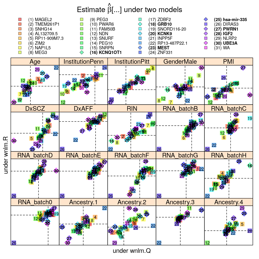
Weighting for the normal linear model
Overall good agreement, suggesting relatively small impact of weighting.
